The Telegraph reports on this man and this book, which has a bearing on culture and all that.
Quote:
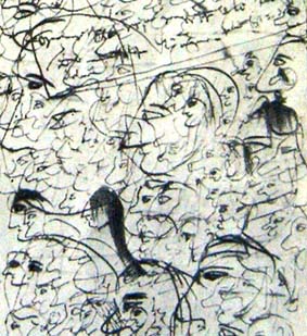
Newly hatched gulls get their food by pecking at a red spot on their mother's yellow beak. The birds don't even need their mother to be present - they are as happy pestering a disembodied beak as the real thing.But 50 years ago Niko Tinbergen, an Oxford University scientist, made an extraordinary discovery. When presented with an abstract version of the beak - a yellow stick with three red stripes - the chicks went crazy. The stick excited the baby birds far more than their mothers' bills.
Tinbergen's creation bore no resemblance to a real beak and yet to the birds' brains it was somehow more "real". By exaggerating the reality of a beak, Tinbergen did what all artists strive for - he captured the essence of reality.
The experiment raised intriguing questions about the nature of art. If a hyper-real painting triggered such a reaction in the visual processing regions of a bird's brain, might not art be doing the same in human minds?
Vilayanur Ramachandran, professor of neuroscience and psychology at the University of California, San Diego, author of The Emerging Mind and one of the world's leading neuroscientists, believes the answer is yes.
So Modern Art is the product of Darwinian evolution. Well, cartoons anyway.
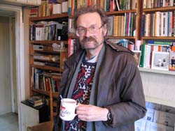
Once again, the fact that photography is all about a machine reacting to light, is punched home to me by these three pictures, two of which I took, and one of which someone else took of me and my speaker, at my Brian's Last Friday meeting last night.
Start with the one with me in it. This was taken in my living room, where the light is rather dim. But you can still make out Jacky D and me, me wearing my serial killer glasses, the ones I use for computer work. But the lighting is not flattering, is it?

Sadly, Jackie D has just announced that she is having a hiatus with her au currant blog (i.e. that those two links are liable for a while to take you to the exact same place), on account of having other things to attend to. I hope having to give the talk last night wasn't the last straw that temporarily broke her blogging, and I hope that the pause is indeed temporary.
Veteran libertarian and regular Brian's Fridays attendee Chris Cooper, on the other hand, is back blogging again after a long gap, so blogging comebacks do happen. His latest posting was put up as recently as February 12th.

Talking of serial killers, that's Chris on the left, with the bread knife. But he only had designs on a swiss roll (I think it was) so Ernie doesn't need to look so disapproving. But the light in my kitchen is a lot better, isn't it? Bruce the Real Photographer wasn't impressed with the excess of diversioary business in the background, but I rather like all that.

This, making better use of the light in the living room, what there is of it once again all being on the wall rather than in the centre of the room, is a study of John and Gareth, looking as if they are about to have a duel, but they're just talking to different people. I must do something about that bit of wire hanging down.
More seriously, what this shows me is that, now that I can do indoor portraits without too much bother, the difference between this level of domestic light and that rather better level suddenly looms large.
The smartest move I ever made with this camera (as I think I may have said here before), other than buying it I mean, and learning how to use it indoors, was getting a 256MB Flash Card. This turns me from a careful, mustn't-waste-it amateur into a pseudo-pro who clicks away so much that people stop noticing. Now, taking a portrait, as I said to Peter Cuthbertson last night while snapping away at him, reminds me of that thing you do when buying shares, when you spread your purchases over a predetermined period rather than doing it all at once. Click-click-click-click-click-click regardless of what the subject is doing. Your chances of one being good are good. (With shares you can't just delete the bad purchase decisions. With digital photos, that's exactly what you can do.)
I'm learning. When I next try taking pictures of Important People at an Important Event, my chances of success will be that much greater.
As soon as Michael Jennings (now of oh you're Michael Jennings fame) has a proper job, which he now says he is optimistic about, we must start a campaign for him to get a Canon A70 also, so that he can be our user group Guru, in addition to taking better pictures himself. It occurs to me that Antoine, Patrick and I might actually throw a couple of tenners each at him to buy the A70 rather than another camera, so helpful would it be for us to have him actually reading – and even making some sense of – the A70's baffling manual. Seriously, the London bit of the blogosphere would be a photographically far more expert place if Michael had the same camera as the rest of us.
I want a copy of this book. (Thanks to this guy for the link.)
 Blurb quote:
The Voluntary City assembles a rich history and analysis of private, locally based provision of social services, urban infrastructure, and community governance. Such systems have offered superior education, transportation, housing, crime control, recreation, health care, and employment by being more effective, innovative, and responsive than those provided through special interest politics and bureaucracy.
However, although perfectly willing to pay for things, I have never mastered the art of purchasing things on the internet, one of the reasons being that a very good and dear friend of mine does this for me, so I've never needed to learn. Also, I've never been that brilliant at embedding urls (?) into emails. Plus, I want to share this email with the world.
You know who you are. Please get in touch, and tell me you are onto it. The paperback, please. Many thanks.
 So I was browsing through one of the art books my brother brought me the other day, and I liked the look of Vincenzo Morosini, painted by Tintoretto in about 1580. Here are two different versions of it. I like the colours of the one on the left, which I found , but it is disappointingly small. And it's no use enlarging it. It would just end up looking electronically enlarged, and even less like the original painting, or any sort of painting, than it did before.
 This, on the other hand, to my right, was more than big enough for my purposes, but the colours look all wrong. And if you look here which is the page of images thrown up by google when I typed in "Tintoretto" and "Morosini", you'll see that most of the pictures there are like this one, and in fact, if my guess is anything to go by, several of them probably are this one.
Until now, I would just pick out the least bad picture of what I wanted, and ignore the rest. But these pictures are really bad, and make me think of all kinds of questions.
Is most of the imagery on the internet of old oil paintings this tacky? Is the situation getting better? I'm guessing: yes, but only very gradually.
And: have I finally picked an unpopular painting out of an art book, and is that why the internet versions of it are so abysmal?
Who do you reckon did this, and while doing what?
 The answer is here. And this is who put me onto it.
She comments on it also. Concluding wisdom:
… we are deeply programmed to find the human face interesting.
Indeed.
I like doing these little "how about that" postings. Such things enliven any blog, and don't take long to do. You don't always want to be ploughing through elongated profundities.
I've had quite a bit of positive feedback about this posting, also involving faces, and also a quicky.
To be rather more serious about the Norman Lebrecht piece linked to in the posting below, here is his final paragraph:
The lyric arts will never thrive until executive directors are allowed as much executive freedom as the managers of any industrial installation. The key to running a good arts centre is not a bottomless budget or flow of singing talent but the simple, straightforward right to get on with the job.
Which is one way of looking at it.
Here is another. When you have a job that a lot of people understand, or think they understand, your hands are bound to be bound more tightly than if the job you are doing is one that hardly anyone else even realises exists, let alone even pretends to understand.
Suppose you are the lead singer of the Rolling Stones, circa 1970. You get to rule the roost, unless you are content to let someone else run your life for you in the manner of Elvis Presley, simply by virtue of being the only person who really knows what you are doing.
I did the pamphlets for the Libertarian Alliance for twenty years. I got paid nothing, but the principle still applies. Before the Internet, most people had no clue what I was doing. Why all those stupid pamphlets Brian, that no one is reading? Everyone else was obsessed with publishing, in large numbers, and distributing, in large numbers. If they couldn't do that, then what was the point? I knew that the important thing was that stuff was getting written, that some people were reading them, and that around all this writing and reading a London libertarian scene wasforming itself. Distribution would happen, by one means or another, some day. So long as the pieces were written in a way that would survive the delay, I knew I was doing something valuable, if not immediately so than some day. And because only I really understood and believed in what I was doing, I was pretty much left to get on with it, as I thought best.
Then came the Internet, and suddenly there was a mass distribution channel available, and everybody suddenly saw the point of what I had been doing. Also, lots and lots of people started writing (because now they could instantaneously publish) similar stuff to what I had been editing.
At which point I stopped enjoying it, because at that point I was suddenly surrounded, like Norman Lebrecht's beleaguered arts administrators, by people who understood what I was doing. I started to feel like a slave, doing what everyone expected. If lots of others could now see what needed doing, they didn't need me to be doing it any more. One of them could do it. And since, as I say (and unlike Lebrecht's arts bosses), I wasn't even being paid, I said to myself: enough. I made way for someone who doesn't have my problems doing what is expected of him by others.
And now I'm doing something else that lots of libertarians think is a waste of time, and which most of them have no clue about, and I am back to enjoying myself and doing things as I want.
So now back to those arts managers of Lebrecht's. The reason their hands are tied is because the institutions they manage have been part of the scenery for many decades, and have accumulated supporters and donors and helpers and underlings, all of whom know what is being done at least as well as whoever is nominally in charge, and all of whom have opinions at least as valid – or so they think – as those of the supposed boss.
The idea that somehow, in circumstances like these, the boss can be magically given more authority than reality will actually allow him is, well, unreal. To run such institutions as these, you need people who positively expect their hands to be bound up in bureaucratic tape and procedure, and who know how to live within such limits and make the best of them.
For Lebrecht to get the kind of arts managers he wants, they would have to be doing something radically different and new, and whatever he may say about it, the people now running opera houses and symphony orchestras are not and cannot be doing anything radically different from one decade to the next. "Radical" doesn't mean putting on slightly different operas in slightly different ways, or daringly deciding that the LSO should produce its own CDs. These moves are business as usual, slightly adapted for the changing times. Good business, admittedly, but hardly radical. Radical would mean something like completely rethinking the meaning of opera, and that isn't going to happen in a conventional opera house. It can't.
I missed this, from Norman Lebrecht, about the recent and clearly much to be regretted demise of the boss of Carnegie Hall:
Harth was 47, a softly-softly manager who, over two and a half years, rebuilt confidence in America’s premier concert venue and inaugurated its underground Zankel Hall with an enterprising programme of jazz, solo recitals and world music. A fitness fanatic, Harth worked out daily in the local gym. His death, of a heart attack, sent shock waves through the upper echelons of America’s performing arts.
Am I the only one who feels a deeply ignoble thrill of pleasure when a health fanatic drops dead, very possibly as a direct result of his obsession? I fear not.
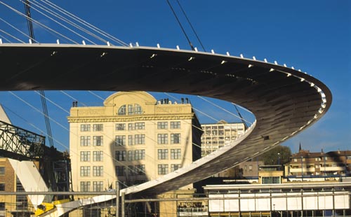
Knowing my fondness for stylish new bridges, a while ago David Sucher emailed me – and knew that I would like the look and the sound of – this:
The bridge is Mr. Calatrava's first free-standing bridge in the United States. Scheduled to open in April, it is already poised to alter the image of a conservative, decidedly unaffluent community that has struggled with its identity since the decline of the timber industry in the early 1990's. Shaped like a reclining harp with an aquamarine glass deck, the bridge threatens to bring high romance to a river whose niche in the popular American imagination has never rivaled that of the Hudson or the Mississippi.
It's a new footbridge in Redding, California, for crossing the Sacramento River. My personal map of America has no red bits at all, so I don't really know where this is, but it sounds wonderful.
Footbridges have been on my mind a lot because of the three new ones across the Thames in London: the Millenium and the two Hungerfords. As I explained in this posting, walking towards Charing Cross on the downstream Hungerford is especially good fun, because when you get to dry land the fun doesn't end. The footpath dives into a tiled mystery world worthy of a Jack the Ripper movie, and then, in order to find its way to a new (i.e. last decade or so) bit of elevated walkway, it goes over this:
… which I think is nice, although I agree, many may not be that impressed.
You then either nip down some stairs into Villiers Street (get an A-Z – I can't be explaining everything) or you go through the concourse of Charing Cross Station. Either way, you discover that at the top end of Villiers Street, there is another footbridge.
This seems to connect the Charing Cross Hotel, which is right on top of the old, still olden style, people entrance to the railway station (the train entrance having been totally redone) to …well, I'm not sure. The other bit of the Charing Cross Hotel, the other side of Villiers Street? None of the websites involving the Charing Cross Hotel make any mention of this little bridge, even though it surely deserves a nod of recognition. It looks as if it was built at the same time as the hotel and station itself. Anyone able to tell us more about it?
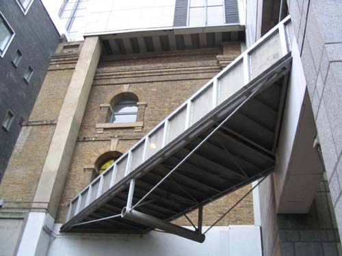
And talking of private, covered and rather mysterious footbridges, I now come to the bridge which regular Brian's Culture Blog commenter Tatyana Epstein told me to photo, and eventually gave up asking about because she assumed I was not interested. But I was and I am. This bridge is the real point of this posting. What delayed me was that I found it rather hard to photograph. Plus, I wanted to do a longish posting about footbridges in general, to get them all out of the way, rather than just a casual snap of this one little bridge, and then have more footbridges in later postings, and more, and yet more, until everyone got fed up with footbridges.
Anyway, Tatynana's bridge connects the Royal Opera House Covent Garden with the Royal Ballet School.
There is something very charming about a balletically beautiful footbridge enabling ballerinas to get from their ballet-nunnery or whatever it is, to their big cathedral, without having to cross the street, where the poor little creatures might be attacked and damaged, or where they might be persuaded by passing graphic designers or record producers to forget their ballet vows.
The new 9.5m span footbridge for the Royal Ballet School crosses Floral Street at fourth floor level and provides a direct link between classrooms and stage for the ballet dancers and staff of the school. The design addresses a series of complex contextual issues and is legible both as a fully integrated component of the Royal Ballet School and the Royal Opera House, and as an independent architectural element with a strong identity.
Yeah yeah.
The skewed alignment and the differing landing levels dictate the form of the crossing, disfavouring ‘neutral’ orthogonal solutions which would result in an inappropriate geometric interaction with the opposing buildings, and accentuate the fact that the bridge is pragmatically planned. The complete bridge structure was pre-assembled off-site before being craned into position in one efficient operation.
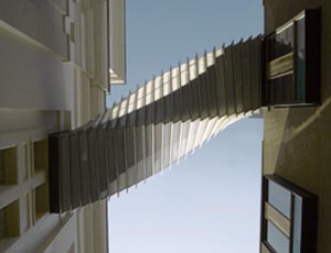
Well, if website guff like that is the price of this bridge, then I'll gladly pay it. Nevertheless: pragmatically planned, nonsense. The pragmatically planned answer would have been a simple rectanguloid box at an angle, not unlike the pleasing but aesthetically modest footbridge in the first picture here, but with a lid on it in the manner of picture number two. As it was, designers Wilkinson Eyre used the arkwardness of the site as an excuse to build a really weird and wonderful bridge.
Not having access to the inside of the bridge, or to the roof right next to it, or, to be frank, being such a good photographer, I was unable to take any photos as good as the ones here (scroll down a bit), at the Wilkinson Eyre website, by one Nick Wood, of which those two are my favourites:

The best I could manage was this, below. Still, at least the picture is black, white and blue, which Tatyana likes.
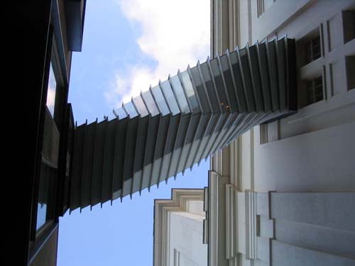
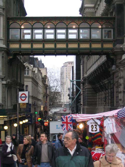
 Plus, on the right, here is a less satisfactory picture which at least gives you an idea of how the bridge relates to its architectural setting, spanning Floral Street way up high. I will have another crack at this bridge in the summer, when there is more light around, and when it lasts a decent length of time and isn't fading into gloom by the time I get there.
I'm really looking forward to my photographic summer of 2004. I'm learning about my new camera all the time. For example I have recently learned how to take adequate portraits indoors (see the picture of my brother Peter in the posting immediately below this one) without flash – about which I feel an entire blog posting coming on. As I discover more about it, I am ever more relieved that it is pocketable enough to have with me always, and not so expensive that I am totally terrified of dropping it in a river or something. Just rather.
It has already reached the point where, if I did drop my Canon A70 into the river Thames, I would immediately replace it with another Canon A70, which is the ultimate accolade. Further Canon A70 news: my good friend Antoine Clarke, in accordance with the logic of this posting has also just bought a Canon A70. He paid around £180 for it, apparently. So that's a three man user group already, consisting of me, Patrick Crozier, and now Antoine. Four, if you count David Farrer who has, if I recall it right, the (very similar) Canon A80. But I digress.
Final footbridge. I once lived in Newcastle, but I was long gone when they got around to building this:
This is another in the Brian collection of Bridges That Are Longer And Curvier Than You Might Think But For Good Reasons (see comments). This one is long and curved so that it can be lifted up in a way that automatically turns it into an arch, while it still remains in one piece. Very cute.
It features in a recent Newcastle based rom-com movie which I enjoyed more than practically anyone I know or know of, called The One and Only. I couldn't find any production stills of The One and Only, featuring the new footbridge or featuring anything else for that matter.
But for some really terrific pictures of the bridge itself, including the one above, go here. That one, above, shows how curvy the bridge is. This picture, on the other hand, is probably the most dramatic, featuring also other bridges beyond it:
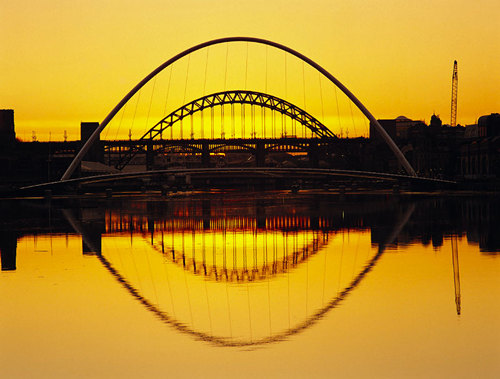
And this one is the most informative, because it shows the bridge in the up position with boats going under it:
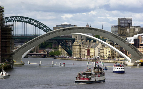
Beautiful. I must go there sometime and take a proper look at it. And all the other Newcastle bridges of course.
And with that I will now take a vow of silence on the subject of bridges, for a while.
 Brother Peter is a book dealer, and since he regularly visits London to participate in a Gamelin orchestra, and since his book dealing often yields little clutches of books that he can't sell for anything worth getting, but which are of interest to me, he visits from time to time, with goodies. He did this yesterday. I am now finding art books especially useful, because I can browse through them and whistle up the pictures in them on the Internet, because the art books supply titles, and with a title I can search.
However, the two pictures here are my own. One of Peter, which I was able to take quickly (thanks to my new photographic superpowers) and show him on my computer screen within about half a minute. The other is also by me and is called 18 Nescafé Gold Blend Jars 2004.
This was inspired a picture in one of the books Peter brought, Pop Art by David McCarthy, one of the Movements in Modern Art series published by Tate Gallery Publishing. That picture is called 200 Campbell's Soup Cans 1962, and is by Andy Warhol. However, Warhol's picture involved rather more work than mine, because if you scrutinise it you disover that the soup cans are not identical, the way my coffee jars are (is). On the contrary, twenty different soup flavours are involved: onion, consomme, tomato, mushroom, green pea, cream of asparagus, scotch broth, cream of celery, chicken gumbo, vegetable, beef noodle, clam chowder, vegetarian vegetable (how that differs from vegetable vegetable I cannot say), pepperpot, cream of chicken, black bean, bean with bacon, cream of mushroom (evidently different from mere mushroom), chicken with rice, and beef.
As it says here:
When Andy Warhol started painting Campbell's soup cans in 1962, the company sent lawyers along to investigate. Little did they know, then, what an effect the paintings would have on their sales, as a new movement in art, Pop Art, was born; and all the experts could do was watch with bemusement and astonishment, as Andy signed soup cans and sold them as souvenirs.For the early paintings Andy used the red and white of the original cans - but later he incorporated a wide variety of arbitrary colours.
200gm Gold Blend jars signed by me are available on request, price £500 each.
 The ever alert Dave Barry links to this.
With these innovative and playful designs, Meike dazzlingly transforms the bathroom experience, giving a whole new meaning to the term 'total relaxation'. Today's hectic world doesn't usually allow much opportunity or time for our fantasies, but the Bathroom Mania! designs help us to let our minds relax and drift off into another, imaginative world.
And I say that when you are trying to take a piss, you do not want your mind occupied with thoughts of getting a blow job.
The good news is this (scroll to the bottom, if you'll pardon the expression):
Most of these designs are prototypes and not yet for sale. If you are interested in manufacturing any of the Bathroom Mania! designs, please be so kind to contact us.
Please be so kind as not to manufacture this one, please, anyone. Stick this "prototype" in an art gallery where it belongs.
Get infected by the Bathroom Mania!
No. Don't.
I did a posting yesterday on Samizdata about old classical recordings, mentioning these two in particular:


These are this one and this one in this list of Great Violinists.
The comments are piling up, of which I like this one best so far, from Alan Little:
Look at those wartime Furtwängler recordings we talked about a while back: they are out of copyright, and whoever has the master tapes seems to be willing to let pretty much anybody (anybody who is willing to pay, presumably) have a go with them. The result being that there are several CD editions of all of them, and whole usenet discussions about exactly what slightly-off speed the original tape recorder was running at, whether it is better to accept that the tape recorder was running at a slightly off speed and therefore have the CD sounding a little sharp, or to try to correct it and risk introducing some other distortion or "unauthenticity", etc. etc. etc.There's also a marvellous article by Peter Gutmann singing the praises of early recordings by Joachim (the great nineteenth century violinist the Brahms violin concerto was written for) , which goes into how in that era western classical music was improvisational and performers were expected to make more contribution than just "playing the dots" in a technically perfect manner.
Twentieth century classical music making was, historically speaking, very, very strange, and the more I think about it, the stranger I am certain it is going to seem to future generations. Basically, the entire profession "played the dots", to use Alan's phrase. Most of the time they were playing pieces by people they couldn't talk to or play along with, the way the pop people play along with each other (the pop composers and players being all mixed up with each other). The "authentic" phase which erupted once normal recordings had been made of everything only took to extremes a trend that had been established in modified form ever since recording began, and in some ways served to correct some of the extremes (of non-improvisation for example) of those normal recordings.
Soon, the classical (for want of a better word) profession will revert to true normality, with the composers and the players going back to being the same people, improvising confidently, because the composers will be right there on the stage or in the studio and available to encourage or frown instantly.
The reason I get so exercised at what a ghastly non-musician Thomas Adès is is that he is doing the most important thing in classical music right now, on which all else depends, namely composing, but is doing it hideously badly, to enormous acclaim from all the idiot critics, and to utter indifference from the rest of the universe. The critics are touting him as the Next Big Thing, but he is nothing of the kind. He is a weird after-echo of the old twentieth century regime, in the form of a sort of living reconstruction of a Dead White Composer, who relates to current classical music making pretty much as Beethoven does, but with the one little little problem that he ain't Beethoven.
What is needed in the classical world is not a steady trickle of Fake Great Composers, but a healthy flow of genuine lesser ones (from which posterity can be left to pick the great ones at its leisure), who can make use of all those violin and cello skills by writing entertaining music that will pay the rent. Adès doesn't pay any rent. He consumes rent. He is a classical music asset stripper, whose career will last only as long as idiots are willing to throw money at him in exchange for the simulacrum of greatness.
The film people are the nearest thing we have to a profession of this sort, but I have yet to hear anything from that fraternity that is not drearily derivative. The best that they now contribute seems to me to evoke olden times, by writing olden style music, as and when that is needed, for olden times films.
Oddly enough, one of the people who gets nearer than most to doing the job well is the much scorned (by critics rather than by punters generally) Vanessa Mae. But that's a different posting.
Here is a New York Times article by Substance of Style author Virginia Postrel on the rise of the aesthetic economy.
Quote:
The official job counters at the Bureau of Labor Statistics don't do much to overcome our blind spots. The bureau is good at counting people who work for large organizations in well-defined, long-established occupations. It is much less adept at counting employees in small businesses, simply because there are too many small enterprises to representatively sample them. The bureau's occupational survey, which might suggest which jobs are growing, doesn't count self-employed people or partners in unincorporated businesses at all. And many of today's growing industries, the ones adding jobs even amid the recession, are comprised largely of small companies and self-employed individuals. That is particularly true for aesthetic crafts, from graphic designers and cosmetic dentists to gardeners. These specialists' skills are in ever greater demand, yet they tend to work for themselves or in partnerships.
So read this blog regularly, and make yourself more employable.
Personally I prefer a world in which the government doesn't spend its time counting people, or come to that doing anything very much. To make her point, Postrel sounds like she'd actually like her government to go snooping around among the ranks of the self-employed, aesthetic and of every other sort. That aside, the point she makes is a good one.
Thomas Adès has been much touted as Britain's version of the future of classical music. I don't see it, myself, that is to say, I don't hear it. His much touted opera The Tempest just sounds to me like every other Brand-X subsidised recent opera that I've ever heard, tuneless and pointless. The result of having the words sung opera-style by opera-style singers is that you can't hear them, and the result of the orchestral backing is to turn everything into emotionally meaningless modern-music wallpaper. I listened to quite a lot of it on the radio last Wednesday, and it just sounded like re-heated Schoenberg left-overs. Now I'm watching it on the telly (the Scotland v. England rugby having finished), and although it is being sung in "English" – i.e. operatic wah-wah-wah Arnglarsh – they have subtitles for you to make out what the hell is being sung, which are needed, let me tell you. For if you care, I mean, which I do not.
There are two rules for this kind of operatic composition. First, the singers sing "tunes" that are almost, but not entirely, constructed of randomly tuneless notes. If they sang truly randomly, then every half hour there would be an actual tune, just by the law of averages. This never happens. Second, the particular form the non-tune-ness takes is that each note has to deviate by about four or five notes from the previous note that is sung. Often this results in mere see-sawing. Occasionally the next note is higher than the previous one and the one after that goes still higher, or the same thing downwards. This non-tune has no connection whatsoever with any meaning that would, without all this non-music churning away, be discernible from the words, in the event that one could hear what they were.
In this version of The Tempest, Shakespeare's plot has been approximately kept, with the obligatory moral promotion of Caliban and moral demotion of Prospero (this I learned from a Radio Three announcer rather than from the damn thing itself), but Shakespeare's words have been rewritten by someone now alive, in the manner of the appalling and superfluous New English Bible (may it burn in Hell). This was probably wise. I once saw an opera done in the same musical manner by someone called Humphrey Searle, based on Hamlet, and using Shakespeare's original words, thus:
. . . . . . . . . . . . . . . . . .thart. . . . . . . . . . . . . . .
. . . .bar. . . . . . . . . . . . . . . . . . . . .quarss. . . . .
. . . . . . . . .nart. . . . . . . . . .ars. . . . . . . . . . . . .
.Tar . . . . . . . . . . . . . . . . . . . . . . . . . . . . .charn
. . . . . . .ar. . . . . . .bar. . . . . . . . . . . . . . . . . . . .
. . . . . . . . . . . .tar. . . . . . . . . . . . . . . . . . . . . . .
. . . . . . . . . . . . . . . . . . . . . . . . thar. . . . . . . . . .
Etcetera. Not a success. By being made to listen to a modern-operatically fucked over version of Shakespeare's original words you were constantly, for every single second of this absurd ordeal, reminded of the difference between artistic excellence and artistic idiocy. So replacing the Shakespeare Tempest with an idiot Tempest for this Tempest was a wise precaution.
This Tempest does seem to be a little better than that Searle/Hamlet absurdity, but only a little. To be exact, sometimes everyone sings fast and incomprehensibly in the idiotically up and down style. And on other occasions everyone sings v-e-r-y s-l-o-w-l-l-y, in the idiotically up and down style. It is this tiny concession to theatrical effectiveness and meaningfulness which presumably has got all the critics gibbering that this is a Great Occasion, the Most Hotly Anticipated piece of blar blar blar, etcetera, ever in the whole of human history since the last piece of garbage like this we tried to make other people besides us excited about.
This is producer art. Everyone agrees that it is great, except almost everyone. And, without caring tuppence about it, almost everyone is paying a great deal more than tuppence for it. If the people who say they like this nonsense had to pay for all of it, it would surely cease at once.
I'm working on a rather unwieldy posting with lots of photos which I don't want to rush, so it's fobbing off time.
So, about the previous post, the one where I disagree with Dennis Dutton, and by way of elaboration: what I think happened was not that twentieth century classical composers, and artists in general, just stopped believing in transcendental values, exactly. Nor was it a case of positively wanting something different, and nastier, as I think I implied in the previous post, in fact as I think I said. That wasn't it. What happened (I now think on further reflection) was that the traditional tonal language of music became tainted in their ears, and representational art became tainted in their eyes, by what it started to be used, in the twentieth century, to celebrate. To be blunt about it, artists felt that traditional art got stolen by hideous politicians.
Take Mondrian. I'm no Modern Art expert, as regulars here well know. I'm an innocent when I go to art galleries, which has its uses and generates its own insights. But I do recall reading something somewhere, in some Art Book, about why Mondrian turned his back on representational art. It was the politicians. It was that vile God, the one who was on "our side", everywhere, right in the thick of all the fighting. I refuse to tell stories with my pictures, he said, because the stories now told by representational art are all monstrous. My paintings are not of anything. They are themselves. They have no meaning, other than what they simply are.
It was as if the artists went on strike. The world wants us to tell lies about God, and about Workers, and about Aryans. Well we won't. And if that means we tell the world a great Nothing, then so be it.
We refuse to sing in tune. Tunes are tunes of spurious glory. Tunes marched the West into the slaughter of the trenches, and tunes wave a blood-sodden red flag or a swastika. Screw tunes.
That, I think, is how Transcendental Values factored in to twentieth century art. It's not that the artists abandoned them, more that they recoiled in horror at the way that monsters hijacked the traditional means of expressing Transcendental Values.
But Dutton's notion that the problem was merely technical, if that's what he truly said (and I realise that I am often wrong about these things), remains, I humbly submit, quite wrong.
There's a first. The paragraph which I think may be somewhat wrong is the second of these two that follow. "Murray" is Charles Murray, and the offending excerpt is from this review essay
Murray is right to stress the importance of meaning it – of commitment in the arts. He tells of the stonemasons who sculpted gargoyles on Gothic cathedrals. They worked with passionate devotion, even when their handiwork would be invisible from the ground: God would see it. I discovered a similar aesthetic psychology in my own fieldwork in New Guinea, where serious artists view a carving created for a dead ancestor differently from one knocked off for tourists. Much of our own art and entertainment is shallow and flashy, made neither for God nor ancestors, but for a market.But, accepting this does not mean that transcendental values form a principle necessary to explain high achievement in the arts. Consider the history of music. Murray makes it clear that the invention of polyphony led to more complex structures that, along with improved instrumentation, continued through the fifteenth century and into the sixteenth. The Himalayan heights of music were reached 150 years later, from the middle of the eighteenth century to the beginning of the twentieth. If there is progress in this period, it is the progress of artists who responded to the problems and potentialities inherent in musical tonality. New instruments, developing popular audiences, a sense of formal experimentation, and above all the maturing of tonality were the driving forces for the great flowering of music through the eighteenth and nineteenth centuries. It was, in other words, the birth, flourishing, and exhaustion of organizing structures, not transcendental values, that provided the most important motor for music development.
I think, on the other hand, that the nineteenth century was positively pulsating with transcendental values, and that it was these very values which ran out of steam during the early part of the twentieth century. It wasn't that the possibilities of tonality had been exhausted. It was that the composers were no longer as interested in pursuing those possibilities. Tonality no longer said what they wanted to say. They lived in horrific times, and they wanted horrific music. Dutton may well be right that you can have great art without transcendental values, although personally I doubt it, but he has picked a bad example to illustrate his claim. That's what I think.
I strongly recommend this most enjoyable attack on plastic surgery by Alice Bachini. The attack is by Alice, not the surgery. That would be an even worse idea. It's not so much that I agree, although I think I probably do. It's how well written it is, and how amusing it is to read. I was going to copy and paste my favourite paragraph, but all of them as so good you'll just have to go there and read the lot.
I also think this posting is very funny. Here's all of it.
I really like reading Mrs Du Toit. It's a bit like taking a bracing run round the estate grounds at 6am, followed by a cold shower. In a good way, I mean. I think if I met Mrs Du Toit in real life, I would crumble into a corner and be all pathetic and English and unable to string two words together. If the word "marriage" was mentioned I would most likely run away and then get mistaken for a bunny rabbit and accidentally shot, and it would all be my fault. However, I really like reading Mrs Du Toit.
How to sum up my opinion? Well, put it this way: observe how I have categorised this posting.
 Here's another posting, in the manner of this previous one a few days ago, about a CD of rather obscure music that is well worth investigating if you like that sort of thing.
I'm talking about a double disc of violin sonatas I have recently acquired, composed by Heinrich Ignaz Franz von Biber (1644-1704 or 1705 - there seems to be disagreement), and played by period violinist John Holloway. These are the so-called "Mystery Sonatas", and if you scroll down at Holloway's site, you'll find a reference to these discs. The recording of them was done in 1991, and it has recently been reissued as a bargain double. I got it at HMV Oxford Street, for a mere tenner. It is very fine.
I was provoked into purchasing these discs by hearing what I now realise was a far more recent and even more remarkable recording by John Holloway, also of Biber violin sonatas, on BBC Radio 3 on Thursday February 5th. On that morning we lucky Radio-3-ites heard Holloway playing Biber's Violin Sonata No. 3 in F, which dates from 1681. It is a truly extraordinary piece, full of super-virtuosity and high spirits of the sort you would expect more from something written by Bartok, or maybe by some gypsy violin king. I will keep an eye open for this disc in the second hand shops – and for anything else by John Holloway come to that, because he is an amazing musician. (I see that he has done some Bach violin sonatas also.) Until now, Holloway was to me just an obscure name, but that has all now changed.
My particular bugbear about "period" musicians, which I have often blogged about, is the way so many of them come down like elephants descending from airplanes without parachutes on the first notes of every bar. Holloway doesn't do this. When he plays it, it still sounds like music, rather than like some mad old music teacher beating time, and nothing else.
More to the point, he really sounds - and again, as so many period musicians seem to make a point of not sounding - like he wants to get the absolute most he can out of his instrument, and make it sound just as glamourous and exciting and enthralling and effective as he can, as Biber himself also used to do, apparently. Biber didn't play his sonatas while thinking: "I must be careful not to make this sound like Tchaikovsky." He played them for all they were worth.
Via Instapundit, I got to this:

And it's British. In Middlesbrough.
Talking of bridges, the Samizdata commentariat has now, it would appear, sorted out why the Coronado Bridge was paid for by the Federal Government and why it is so long and so kinky. And it actually does seem to make sense, as I at first contested with extreme enthusiasm. Or rather, as David Sucher notes, it makes sense if you are content with how civilisation won the Cold War, as I am.
Busy day today, so maybe that's your lot. But despite threatening nothing over the weekend, I actually put up quite a lot here, so you may still now have quite a bit to catch up with.
Could someone please explain what on earth is the significance, if any, of the fact that Brian's Culture Blog is featured in this chart? It is in the second column from the left, four down. And what does "Rb" mean? Rhubarb, perchance? I sense that this may be good news, but have no real clue. Aside from noting the number of and content of the comments and commenters here, I have never otherwise counted or analysed my readers, beyond looking in a mirror and saying: one.
My thanks to David Sucher – as he points out, my neighbour in the chart to the immediate left (and what does that mean?) – for alerting me to this.
I also looked at other neighbours. Dave Barry you will know about already, if you come here regularly. But how about this blog, immediately to my right, dedicated specifically to photography? I am greatly encouraged by the message that blurry is okay but fear that when he says "toy camera" he means one like mine. Lots of links to more photography.
And this is definitely what my elderly but ever polite mother would call, after a pause: interesting.
This great bit of computer animation about the brutality and futility of life is linked to by b3ta.com.
Lefty grumblers are hopeless at serious politics, and god help us all when they ever get into complete charge. All they ever cause in those departments are brutality and futility. They make the world a lot more like what they say it already is than it already is. But if, as they always should be, they are prevented from having any direct real world influence and they instead turn to art, their complaints often have great aesthetic merit and considerable entertainment value, as here.

I read a somewhat dismissive review in the latest Gramophone (that's only the link to the mag – the review is paper only as far as I can discover) of this new CD of four piano sonatas by Joseph Wölfl, the once famous piano virtuoso and composer. His dates are 1773-1812, and since then he has pretty much only been remembered as a bit part player in the lives of Wolfgang Amadeus Mozart (1756-1791) and Ludwig van Beethoven (1770-1827). I couldn't, to illustrate the point, find any web page devoted to the man himself, rather than just occasional mentions of obscure and deleted CDs of his music. But then I came across this CD for £4 in one of my regular second hand CD haunts (maybe it was that Gramophone reviewer unloading it), and, since the pianist is one of my recent favourites, Jon Nakamatsu, I gave it a go.
And it is really very good. It's not Beethoven and it's not Mozart, and it wouldn't make sense to say that it is in between. More a case of inhabiting the polished and pleasingly decorated floor between those two stools. But it's good. The pieces are sometimes elegant, and sometimes more turbulent than elegant, in a manner I've not heard the exact like of before. Nakamatsu plays them a whole lot better, and made a whole lot more of them, than that Gramophone reviewer said, in my opinion. I especially enjoyed the last movement of Op. 33 no. 1.
And a little googling reveals that Anthony Holden of the Guardian also liked this CD a lot.
This kind of thing won't pay the rent for the entire classical music industry as it still now tries to operate, but it deserves a nod of praise nevertheless.
That is not a sneering question, it is a statement, from a devoted admirer. I love France. I love its beauty. I love its ability to do beauty. And one of my most favourite intellectuals now alive, anywhere on the planet, is an extremely French Frenchman by the name of Emmanuel Todd of whom much more, in other postings between now and my death, but probably not in this posting.
Today I met up with another Cecile, French Cecile, Cecile Philippe of the Institut Molinari (link will follow), and we got to talking about France, as you do when you talk with French people. Cecile is a libertarian activist, or trying to be, but is still finding her feet, as it were. She is in the slightly arkward position of needing to press ahead with her efforts, while nevertheless not being fully in command of her strategic aims. Like building a house where you aren't sure of the foundations, that kind of thing? Yes, she said. Like that.
I began to orate not about libertarianism, but about France, the object of her attentions, and she seemed sufficiently impressed with what I was orating to encourage me to write some of it down, which, in a very slap dash way, I will now attempt. Since a lot of it – France being France – is "cultural", and since I don't yet feel good about exposing all this to the glaring light of the Samizdata commentariat, I will make use of Brian's Culture Blog to do my thinking aloud. As so often, my most important reader here is me. You can skip this if thinking aloud – very nicely and politely by the way – about France is not to your taste.
What follows is overwrought (partly due to lack of sleep last night – I had to be up early) and partly due to excitement and unchecked hypothesising. Several contentions that follow are bound to be rubbish. Severe first-draft-itis from now on, in other words. You have been warned.
Still with me. Then I'll begin.
If you want to persuade someone of something you have to show that you are on their side, and a libertarian trying to turn France libertarian is very easy to see (if you are French) as a traitor. Libertarianism means turning beautiful, beautiful France into an Anglo-Saxon dump of mindless commerce and disgusting fast food factories, and ultimately conquering the ruins on behalf of the USA. N'est ce pas? Well, that is a typically French assumption, I'm guessing. I don't think I need elaborate on that.
Ergo, a libertarian French person should ask herself the question: What Is Great About France? To prove that you love France, Mademoiselle Cecile, say what you love about the place. That way you avoid coming across as a nag (stop doing this - do that instead – do like Thatcher – stop being so French - how many times do I have to tell you? - blah blah) and prove that you are not a traitor.
Say, in particular, what kind of Great Future you think France has. I surmise that an awful lot of French people now fear that France has no Great Future at all, just a Great Past. France is now beautiful, and the future is nothing but slowly spreading ugliness, and nothing else. Again, I need not elaborate, and more to the point I don't want to. My aim here is to get stuck into the positives?
So: what are the enduringly great things about French culture? What do French people do best, and what can we confidently expect that they will continue to do?
The French do Intellectual abstractions very well. Thinking of them, analysing them, and perhaps above all, persuading others of the truth and importance of whatever intellectual abstractions France has come up with lately. At these things they are world class, and will always remain so, I believe.
Maths. I'm guessing that France has always been great at this. Descartes. Poincaré. Can't think of others, but I am certain there are many more and that it hasn't stopped.
Science. France punches way above its weight in Nobel Prizes, I'm guessing. Cecile said yes, especially now in biology and biochemistry, genetics, etc. The current French lament, she adds, is that all those wonderful French scientists have to go to America to find decent financial support and decent working conditions. But the positive side of it is that France cranks out these great scientists in the first place. America can't produce all the scientists it needs. So: a French export triumph.
As I said, not all French social scientists are to be despised. See Todd above, a genius whose particular genius is in teasing out how Intellectual Abstractions impinge upon every day life in the form of the varying rules of family life in different parts of the world.
And as for the French social scientists – and especially literary theorists of the post-Modernistical persuasion - who are bullshit artists of the top rank, well, my point is exactly that. French has the best bullshitters in the world. They have utterly conquered American academia, and the achievement is all the more impressive given that it is all such complete bullshit. Persuading someone of the truth can be hard, but it is basically an unimpressive achievement, for in the end the truth speaks for itself. But to foist a pack of lies on a generation of American intellectuals, well, that takes some doing. Lies do not speak for themselves. French lies, on the other hand, have a habit of being believed. French intellectuals, perhaps because they always obey persuasion rule number one (first convince yourself), are hugely persuasive and have immense intellectual self-confidence. Their entire demeanour, when they are foisting one of their Great Intellectual Abstractions on you, says: we are French, so it is impossible that we could possibly be mistaken. It is true. If you do not accept it, this is your loss. Take it or leave it.
This works, again and again.
What French intellectuals think, right or wrong, is a fact in the world of collosal importance. When French intellectuals thought Soviet Communism was good, Soviet Communism was untouchable. As soon as the French intellectuals decided, in the late 1970s, that Soviet Communism was foolishness, it was doomed. That is a simplification, but not nearly as much of one as you might suppose. The French are simply the world champions in this kind of thing, i.e. anything ending in "-isation" or "-ism".
Which by the way means that no matter how hard it might be to ever convert the French intellectuals into libertarians, it is still worth the effort, because the rewards will be literally world historical if we can pull it off.
From truth (and lies) to the other great French genius which is for Beauty.
But now I'm thinking I have to stop, because I'm off to hear Cecile give a talk about Intellectual Property. I'm expecting it to be excellent, Intellectual Property being a classic Intellectual Abstraction of the sort that a French person is liable to be very profound about, far more so than your average English speaker in such circumstances. So I have to stop now. So I will. I'll try to do Beauty tomorrow. Failing that, I'll do it Real Soon Now.
Apologies for whatever ill-thought-out not-thought-through rubbish there may be in any of the above. Comments, no matter how dismissive of what I've put will be very welcome. BUT, negative Frog-bashing is extremely unwelcome. If you think France is crap and doomed, etc., fine, and I can't stop you putting that if you really want to, but although I almost certainly won't delete things like that I really don't want to hear about such things now, thank you. That is not my question. I'm asking: What Is Great About France? And: What will go on being great about France? If you have answers and additional suggestions in tune with that optimistic and positive agenda, I'd love to hear them. (This is actually the big reason why I haven't put this on Samizdata. The Samizdata commentariat is just too mindlessly and ignorantly anti-French, and I just don't want to hear all that crap just now, thank you.)
If, having nothing nice to say about the future of France, no one here comments about this at all, I intend to bash on with this line of thinking regardless, in case you were wondering.
Sorry I had no time to include any links. I may correct this later.
I did a posting a day or two ago about the education of Samuel Pepys (1633-1703), at my education blog. The point of it was: it was all of it, entirely, in Latin. No "English literature" was involved at all.
So, forty years after William Shakespeare (1564-1616) had been and gone, the people in England with the best educations didn't learn anything at all about the likes of Shakespeare, or not in their school lessons, or anything else merely in English.
What this tells me is that Shakespeare really was the "commercial" entertainment of his day, as opposed to "high" culture. One of the central conceits of the movie Shakespeare in Love – Shakespeare then equals Hollywood now – is right on the money.

By "low" I don't mean the upper classes shunned it. After all Judy Dench (otherwise known as Queen Elizabeth I) used to go. But the upper classes have always liked to let their hair down with lowbrow entertainment, as well as the posh stuff. Desert Island Discs usually has a pop song or two in among the Mozart and the Beethoven, of whatever vintage the celebrity happens to be. Posh people were going to the movies long before the culturally posh finally accepted movies as a bona fide art form.
By the way, Michael Blowhard linked back only yesterday to the piece Friedrich Blowhard wrote in the early days of the 2 Blowhards blog, and which I remember with great pleasure because it finally made me read Peter Hall's Cities in Civilization, about the economics of the theatre in Shakespeare's London. Recommended now as much as when Friedrich B first wrote it.
The big difference between now and then is that whereas in Samuel Pepys' time, high culture was international, and commercial culture was in the local vernacular, now it's the other way around. Now high culture is locally based and locally supported, and locally worried about, in the face of: commercial culture, low culture, which is now international. Pepys learned Latin not just to "train the mind" but to enable him to communicate with the rest of the ruling class of Europe.
I will not expand on this thought. I need more education myself about such things to do that. But I definitely count it as a thought, and I hope you do too.
Busy weekend, starting now, so no more today, and maybe no more until Monday.
I'm watching a fun little TV documentary about easyCinema.com. Stelios Haji-Iaonnou is trying to do to movie distribution what he has already done to the airline business. He wants to do no frills cinema. He did good business for the first few nights, but then it flagged. Basically, Stelios hasn't had a mega hit since easyJet, despite several tries, in such things as cars and internet shops.
I mostly watch DVDs now, which I rent at a slowly decreasing price from various local shops, including Blockbuster Video. From Monday to Thursday, I can rent three non-current movies for a week, for £5 the lot of them. Not that there's much worth renting, but much the same applies in the cinema from where I sit, and nowadays I never see anything I can't wait a few months for.
But, to speak up for Stelios, in the days when I used to go to the cinema a lot it always used to puzzle me that they didn't go in more for differential pricing. One week you'd be sitting in a near deserted cinema. The next week you'd be queueing all round Leicester Square. Why didn't they knock the price down for the slow sellers, and shift the product? No computers to do the sums? Certainly Stelios would be nowhere without computers, not just for him to do his sums, but for all of us to buy his tickets.
Here's the What's on page and here's the Locations page. So far, it's only Milton Keynes.
I suspect that the real problem for no frills cinema is the rise and rise of home cinema, which has all the frills you can imagine, including such excellent extras as a pause button. I suspect Stelios may have arrived in the movie business a decade too late.
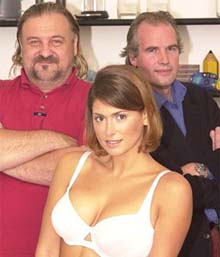 A favourite brousing place for me is thisislondon.co.uk (for I love London more than life itself), and browsing here today I found (click on "British Culture – faces of the year" and go to pic 6) this charming picture. Everyone looks so happy.
What is more, I recognise the two geezers in the background, and diamond geezers they are too. Many months ago, they starred in a series of fascinating TV shows in which they had a go at redesigning various familiar objects. The Shaver, The Toilet, things like that. And one of the things they took a crack at was The Bra. I remember at the time thinking that The Bra seemed like a very well done piece of work, and wondering how well The Bra might do out there in the real market. ("Design Classic" books are full of pictures of famous things that have been more admired by the admiring classes than bought by the buying classes.) Well, it seems that The Bra is doing very well (you have to scroll down a bit).
The Bioform Bra in my opinion uplifts and contours the breasts so well that it immediately takes ten years off a sideways sagging bust. If you are past 40 with a full cup size you may realise that you have not seen your breasts in this position for twenty years. It has the effect of centering the breasts more, whilst uplifting them at the same time. And it does it up to size 42DD with many smaller sizes going up to G cups. Probably the greatest achievement of it, is to successfully lift large breasts and make them look more youthful. Can't be bad, has to be good.
Indeed. Plus, ladies (and gentlemen), there have been developments.
Alice Bachini ruminates about style, saying that Brits who try to be stylish are more stylish than Americans ditto. What do I know? (Or, to be honest, care?) But my real point is that there is a Michael Blowhard essay there too, disguised as four comments. Excerpt:
Many Americans consider making it to be the main thing, and that doesn't lend itself to playing with styles for its own fun self. We're also a world unto ourselves. It's possible to live in the Upper Midwest and take no note of what the rest of the world's up to. This produces tons of provincial cluelessness – Midwestern guys who don't know that the moustaches they're wearing scream "I'm gay," for instance.A commenter at our blog came up with a good explanations for Americans' ambivalent feelings about high art that may apply to style too. It's that many Americans are descendants of people who were either trying to get away from something (perhaps even Euro culture), or who were peasants, and hence suspicious of high-cult things. Style as a conscious thing? We're skeptical.
Me too. Like Americans I am partly descended from religious malcontents, in my case Huguenots who fled religious persecution in France, and came to … London.
So what am I doing running a "culture" blog? Maybe it's because we puritans (if that's what I am) object to people being stylish, but have no problem with objects being stylish. It's the difference between an arrogant swank-about-town and a humble artist or art worshipper. I believe in whatever is the Devout Atheist equivalent of the Greater Glory of God. (With maybe just a little basking in His reflected glory.)
See also Michael's latest piece about "gals" with lots of go-go-go but not as much depth as they might be needing, once their looks begin to go. Lots of good comments there too.
I've been trawling through all my photos looking for transport stuff, either to put there, or to put here and link to from there, in the course of which I found these two photos, both river related which strike me as above average. Why waste them?
I could waffle away about what they signify and why they are so brilliant, but I waffled a lot yesterday, so I'll keep the waffle to a polite minimum and just stick them up and hope that at least some of you like them.
The first is of the Millenium Footbridge, looking up river:

And the second is of boring office blocks, unboringly lit by the evening sun, somewhere upstream of Westminster Bridge:

I love that sunlight on the building dark clouds behind thing. And the water emphasises just how sharp the contrast was.
 This is a memo from me to myself. Read along if you want, and the picture to the right gets explained eventually, but my main purpose with this posting is simply to have a way to get back to the London bit of SkyscraperPage.com and to freeze the knowledge of this page in my memory and archives. I've been rootling around for months looking for skyscrapers, but this is the first time I've come across this coherent list of what's high and what's nigh in the London skyscraping business, what's hatched and what's scratched. I don't understand why I missed it. Maybe I saw it, and then went from it to some skyscraper so dramatic and fascinating that I immediately forgot about how I got there. That is now a lot less likely to happen again.
I mean, what if I got to thinking, say, how much this proposed skyscraper looks like this bird?
What got me started was Chris Tame, to whom thanks, dropping by with a copy of today's Evening Standard, in which I came across this story. I got to SkyscraperPage.com when I googled "122 Leadenhall Street".
It's the work of Richard Rogers, whom I always confuse with Norman Foster. Maybe writing that down will help too.
Okay, who do you reckon did these?

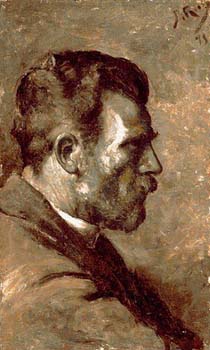
I dare say that there are now many painters who only do modern because they can't do ancient. But not this guy, I think.
You'll find slightly bigger versions here. Both are from 1896.
 Last Sunday evening I had dinner chez Perry de Havilland, and as often happens when Samizdatistas gather chez Perry de Havilland photos were taken and put up on Samizdata. Of those six pix, numbers three, four and five were taken by me.
Aside from my Canon A70 (now improved upon by Canon in the form of the A80 with no doubt further improvements to come), the vital pieces of kit I used were: my recently acquired 256MB Flash Card (which means I don't have to worry about running out of card space and can click a lot to the point where people stop noticing, or noticing so much); and: the little tripod that Perry (a friend indeed) gave me recently when I admired it, and promptly replaced by buying another one just like it for himself to carry on using. It's definitely got the word "Velbon" on it, and I think it's the tripod in this picture. My first picture here shows Perry complete with new tripod supporting his digicam, which is the Sony he used to take his other three pictures. I'm the little guy in Hobbit Corner.
 Three quarters of the battle with these cheap digicams, I'm learning, is keeping the camera still, which is especially the case if you are taking photos without flash, indoors. Flashing away at a dinner party is a deeply anti-social habit, and in any case the results are generally just what you'd expect, garishly lit and hideously unnatural, nothing like a real dinner party at all. So, no flash, and if in addition there is not that much light then stillness is crucial, hence the value of the tripod. Even resting a camera on a wine bottle, in the way I rest it against a lamp post when out and about in London town, is far too wobbly.

Even quite small tripods do two valuable things with dinner party pix. First, they improve the angle and get a little bit further above people's chins. But much more importantly, they raise the camera above all the glasses and clutter on the table and enable people actually to be seen properly. Photography of humans is a very human thing, as well as a technical thing, and anything which reduces the disruption and allows attention to wander from the photography process and back to the party itself gives you an extra little advantage.
 And these particular tripods, like our digicams, are small enough to just keep in a pocket all the time, which means that when we suddenly decide we need them, we actually do have them and can actually use them. I have two other bigger and "better" tripods, but they mostly just gather dust. Too much bother.
Despite all the kit being used, all these picture here (and unlike most of the outdoor pictures I have taken that I show here) needed Photoshop enhancement to brighten and contrast them up. Especially this one, which was the absolute last photo I took that night. Despite the rather unfavourable light conditions, and partly because of them, I got lucky. My human target (Samizdata.net editor Adriana Cronin) stayed reasonably still, while behind her there was commotion.

Result: that nineteenth century human in foreground with twentieth century chaos in background effect that most of us like so much. Usually what emerges from a digital camera in such circumstances is a blurred and deranged twentieth century person in front of a mockingly perfect nineteenth century background.
Jonathan Glancey of the Guardian reports on an amazing building designed by Imre Makovecz:
His most sensational new building is unquestionably the Stephenaeum, an auditorium and the cultural heart of the Pazmany Peter Catholic University of the Sacred Heart's faculty of humanities at Piliscsaba, some 20 km north of Budapest. The Makovecz design - and, yes, it is real - takes the form of two circular buildings, one adopted from the form of a traditional Magyar jurta (yurt), the other a Renaissance tempietto, crashing into one other. Here, it appears, are two opposite worlds, urban and rural, rational and romantic, national and international, trying to match and marry. It is also one of the most striking buildings on show in Hungarian Architecture Today: Modernist and Organic, an exhibition curated by the Hungarian-born British architect, Sandor Vaci, at the Royal Institute of British Architects, London.
The most informative website I could find about this bizarre building is this one, which is all in Hungarian but which has some great looking pictures.

Here is some information about the RIBA exhibition.
Anyone can now take great photos, if they take enough photos. A week or two ago I bought a 256MB Flash Card, which means I can snap-snap-snap away for half an hour and still have space for a hundred and fifty more snaps. Add that to the fact that batteries in digicams now last a decent length of time, and the only thing that now worries me is the size of my hard disc.
What still separates the pros from us Digital Monkeys is that they presumably know how to take the great photos they decide beforehand that they want to take, as well as just the great photos they just happen to take.
This is one I took today, by which I mean that I just happened to take it today. I didn't go looking for it, and I don't think I even saw it in its entirety before taking it. It just looked like something that might work. Marginal cost of going snap: zero. Ergo: snap.

I just shoved the camera against the glass screen that stops anyone from committing suicide by jumping into the Jubilee Line at Westminster Tube Station, and, like I said: snap.
All that is missing is a couple of Gwynneth Paltrows.
From tonight's Friends:
Chandler to Monica: "What are you singing?"Monica to Chandler: "It's Bolero from Ten."
Chandler to Monica: "It's the Ride of the Valkyries from Apocalypse Now."
Chandler was right, naturally.
Classical music fans like me have a mysterious fondness for pieces of music called, thrillingly, something like: "No. 14, opus 27 no. 2", rather than "Moonlight". I'm being ironic you understand. Also, Beethoven's Piano Sonata No. 14, opus 27 no. 2 and Beethoven's Moonlight Sonata are the same piece.
But whence the preference for numbers? Is it pure snobbery, nothing but a perverse pleasure in the esoteric which scares off the vulgar hoards, and nothing else? Maybe that's part of it. There is a shallow thrill to knowing "about" classical music, as well as knowing it, and feeling cleverer than the rest because you do.
But there is a more mundane and respectable consideration at work here, it has just this moment occurred to me.
The reason why numbers are good is that works of art with a number are ... more numerous! There are likely to be a lot of them!
It's a simple matter of economics. In rather the same way that you are more likely to start a business if, other things being equal, you stand to make a lot of money if things go well rather than merely a little, music fans (I'll stick with music, because this is what I really know about) are more likely to investigate a piece of music if, in the event that they like it, they know that there is going to be more of the same to enjoy.
Suppose you adore the Symphony Fantastique, by Hector Berlioz. Many do, for it is a fine piece. But me, I'm irritated by it. Why the hell, if Berlioz was good enough to write such a fine Symphony No 1, did Berlioz not rattle off another five, for all those who take a liking to the Berlioz way with a symphony?
Suppose that Beethoven had only written one piano sonata, the Moonlight, instead of the thirty two that he did write. I surmise that the Moonlight itself would be less popular than it is now. After all, if you gave the Moonlight a try, and liked it, there's nowhere else to go. As it is, if you like the first Beethoven piano sonata you listen to, there are thirty one others to enjoy, and isn't that great? So, all the more reason to give the first one you consider a go.
When you first learn about Brucker's symphonies, say, you pretty soon learn that there are nine of them, and you learn this long before you have heard all of them. Generally you hear all the chatter about the three final and particularly great ones – 7, 8 and 9 – and you hear them first. (That's a guess. I'm really talking about me.) But the mere fact of knowing that they are called 7, 8 and 9 tells you that in the event of you falling hopelessly in love with these mighty pieces, there will be a further six Brucker symphonies to wallow in. (Actually there are eight more Bruckner symphonies, because Bruckner wrote a Symphony No. "0", and even, if you please, an even earlier one now called Symphony No "00"! This was because he wrote them, then "withdrew" them, refusing the dignity of the titles No 1 and No 2 until he had works he considered worthy of such nomenclature, and then these early and at first unnumbered works were disinterred by scholars. You probably didn't know that, did you, you pathetic prole.)
Thus it is that obscure composers who, whatever their shortcomings, did at least write a lot of, e.g., symphonies, such as Arnold Bax (7), Havergal Brian (31 I think, or maybe 32), tend to do better than they would have done otherwise. I'm not saying that Bax is all that bad, or for that matter than (Havergal) Brian is all that good. I'm just saying that, other things being equal, numbers are enticing.
Although music is the taste I know most about for these purposes, I think it was painting that first got me to notice this tendency. The world of painting, it seems to me, is a world which rewards painters who stick with the same themes for longish periods. Think of Mondrian. Think of Bridget Riley. Think of Monet, solemnly doing the same haystack in a dozen different versions. Incomprehensibly creating a vast, matching set of works, rather than hopping about from one genre to another is, for a painter, a smart move. Concentrate, lad.
The usual explanation for this tendency to concentrate is, I guess, that this is how to create really good stuff. You stick with the same formula and perfect it, and you can't perfect it unless you stick with it.
But I think if you look at the situation from the point of view of the consumer of these vast aggregations of similar but not identical works of art, the reason for the success of artists who plough their one idiosyncratic furrow with bizarre determination and single-mindedness makes a little more sense.
I'll stop now, because this is an idea I have only just had, and it may be rubbish. I haven't lived with it, or kept an eye out for anyone else saying it. There are no links in this posting, because I am aware of no one else having said this, and before investing too much effort in this notion I need to know that I'm really on to something original here, and probably I am not.
My guess is that many a music critic has said something a lot like this, in passing, but hasn't quite realised that there is here a defence against that "number snobbery" charge, rather than a mere description of the nature of this alleged snobbery. That, I now surmise, is the original bit of this hypothesis. But even there I could be quite wrong.
Has anybody else said this?
I know it's pathetic, but I think this is rather cool.


I saw one in a digicam shop window, and it's really cute, and very small, just like the cigarette lighter it mimics.
And yet, to be rational about it, many of my friends have digital cameras that mimic portable phones, and the portable phones work as well.
 Today I bought the latest issues of the Gramophone and of the BBC Music magazine.
Both of them provide reviews of the new LSO Live recording of Brahms 2nd Symphony and Double Concerto conducted by Bernard Haitink.
In the Gramophone, Richard Osborne calls it "an exceptional new disc", and says of the recording that it is "rich and immediate" and that it "brings out in gratifying measure the tactile quality of Brahms' writing." The symphony he calls an "imposing and beautifully shaded" performance. And Gramophone editor James Jolly picks this disc as one of his top ten recommendations of the month.
In the BBC's Music magazine, Misha Donat says this:
With Haitink at the helm of the LSO, this ought to be a sure-fire success. Alas, try as I did, I couldn't work up much enthusiasm for what are actually rather middle-of-the-road performances that seldom catch fire. Certainly, the Second Symphony is one ofBrahms's more relaxed works, but it's not without its darker moments - the fortissimo passages in the first movement's development section, for instance; or the minor-mode central episode of the Adagio, with its passionate string tremolos. In Haitink's hands everything is neatly in place, but the music's drama and intensity are underplayed. …
The Double Concerto, he says:
… fares rather better, thanks to some sensitive playing by the orchestra's leader and principal cellist, Gordan Nikolitch and Tim Hugh. But again the finale is short on exuberance. …
But he didn't like the recording.
This new release is not helped by an over-analytical recording, liberally laced with echo, which lays every detail bare, but conveys little idea of the overall sound-picture.
The reason I was so interested to see what they thought of this recording is that I already possess it. So what am I supposed to think? Am I to enjoy it, or not to enjoy it? Am I to be delighted by the richness and immediacy of the recording, or disgusted that it conveys little idea of the overall sound-picture?
My God. I'm going to have to decide for myself.
Last November I posted a picture of the Coronado Bridge which, it was eventually established, is in San Diego. Gareth Rees commented on this thus:
The San Diego Coronado bridge reminds me of this beautiful cross-sea bridge in Macao.
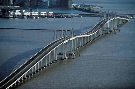
Excellent.
It's the dip in the middle which makes it special. Also, that must make it a lot easier for the ships to know where they're going.
This bridge reminds me of some hills in the Mid-West of the USA which are called, I think, the "Tetons", which in French means … well, I'm sure you can guess, although at ground level I suppose that this impression wouldn't be so obvious. Well, maybe if, as in this picture, you view it from an angle ...
Paul Johnson's vast book called Art: A New History (all 777 pages of it) is a most inconvenient volume. It is very big and heavy and unwieldy, and almost every page seems to contain beautiful illustrations of one sort or another. Also, my copy of it was purchased brand new, which is not my usual practice at all. To me books are cheap and expendable, and meanwhile to be treated without care, preferably purchased second hand for next to nothing. Trying to read this book is like having a priceless first edition on my desk all the time, which it may one day be, I suppose. Yet despite all this, as the posting yesterday (see immediately below) illustrates, I am now dipping into this book, and today I came across an interesting description in it of the early spread of the very printing technology, the modern manifestation of which made this book possible.
At least when reading Paul Johnson's book I don't have to worry about spilling coffee on a Gutenberg Bible. Here's how he describes (on pp. 200-201) the way that was created:
In the years 1446-48, two Mainz goldsmiths, Johann Gutenberg and Johann Fust, made use of cheap paper to introduce a critical improvement in the way written pages were reproduced. Printing from wooden blocks was an old method. The Romans used it in textiles. It was the means by which the Mongol Empire ran a paper currency. By 1400, on both sides of the Alps, devotional pictures and playing-cards were being mass-produced by this method. What the Mainz team did was to invent moveable type for the letterpress. It had three merits: it could be used repeatedly until worn out. It was cast in metal from a mould and so could be renewed without difficulty. And it made lettering uniform. In 1450, Gutenberg began work on his Bible, the first printed book, known as the Gutenberg, or Forty-Two-Line Bible, from the number of lines on each page. It was completed in 1455 and is a marvel. As Gutenberg, apart from getting the key idea, had to solve a lot of practical problems, such as typefounding and punch-cutting, devices for imposing paper and ink into the process, and the actual printing itself, for which he adapted the screw-press used by vintners, it is amazing that his first product does not look at all rudimentary. Those who handle it are struck by its clarity and quality. It is a triumph of fifteenth-century German craftsmanship at its best. Indeed, it is a work of art, in the true sense: the application of manual and intellectual skills to produce a thing of beauty, as well as use. Gutenberg was an artist, and a very important one in the history of art, for the spread of black-and-white reproductions in books, which could be hand-coloured, did more to internationalise art than any other factor.
Which is of great interest to this blog, because most of the art experienced here tends to be either mass produced in and of itself, by such things as printing presses, or reproduced and served up here by similar means.

But now in this next bit, which follows on immediately from the quote above, Johnson deals with something which has always puzzled and bothered me, but which I have not read about very much, namely the extreme hideousness and illegibility of the so-called Gothic typefaces used especially by those early German printers. To my eye Gothic makes all letters look the same, which is hardly what you want with a typeface, now is it?
Well, it seems that I'm not the first to have been scornful of this extraordinarily ugly piece of design, which is plainly a creature of the pen, yet which was dumped, so to speak, onto the printing press. I suppose Germans in those days were used to it. But happily the Germans, much though we all owe them for inventing printing in the first place, were unable to make their Gothic habit spread, beyond the opening credits of war movies of course, as Paul Johnson relates:
Printing was one of those technical revolutions which developed its own momentum at extraordinary speed. Christian Europe in the fifteenth century was a place where intermediate technology, as we now call it – that is, workshops with skilled craftsmen – was well-established and spreading fast, especially in Germany and Italy. Such workshops were able to take on printing easily, and it thus became Europe's first true industry. The process was aided by two factors: the new demand for cheap classical texts, which were becoming available anyway, and the translation of the Latin Vulgate Bible into 'modern' languages. Works of reference were also in demand. The first printed encyclopaedia, the Catholicon, appeared in 1460. The next year, the first printed Bible for laymen appeared, quickly followed by the Bible in German, the first printed book in the vernacular. Presses sprang up in several German cities, and by 1470, Nuremberg had established itself as the centre of the international publishing trade, printing books from twenty-four presses and distributing them along trade routes and at trade fairs all over western and central Europe. The old monastic scriptoria worked closely alongside the new presses, continuing to produce the luxury goods that moveable-type printing could not yet supply. Printing aimed at a cheap mass sale. In 1471 the first best-seller appeared, Thomas a Kempis's Imitation of Christ, which by 1500 had gone through ninety-nine editions.Though there was no competition between the technologies (at Augsburg, the printing presses and the old monastic scriptorium were in the same building), there was rivalry between nations. The Italians made energetic and successful efforts to catch up with Germany. Their most successful scriptorium, at the Benedictine monastery of Subiaco near Rome, quickly imported two leading German printers to set up presses in their book-producing shop. Italian printers had one advantage. German printers worked with the complex typeface the Italians sneeringly referred to as 'Gothic' and which later became known as Black Letter. Outside Germany, readers found this typeface offputting. The Italians had their own clear version of the Carolingian minuscule. This became known as Roman, and was the type of the future. In 1458, Charles VII of France, impressed by the Gutenberg Bible, sent his leading artist-craftsman, Nicolas Jenson, master of the royal mint at Tours, to Mainz, in order to learn 'the art of printing'. But Jenson, having become an expert printer, refused to return to France. Instead he went to Venice and set up what became the most famous printing press in the world. The fonts of Roman type he cut were exported and imitated all over Europe. From 1490 he had a rival: Aldus Manutius, whose Venice press designed and used a practical Greek type for printing the classics, now available and in huge demand among scholars. He also introduced and made popular, c.1501-20, a slanting type based on the cursive hand used in the papal chancery. The international trade called it Italic, and entire books were printed in it before it slipped into its modern role of use for emphasis and quotation.
Hence, although the Germans made use of the paper revolution to introduce moveable type, the Italians went far to regain the initiative by their artistry and their ability to produce luxury items. By 1500 there were printing firms in sixty German cities, but there were 150 presses in Venice alone. …
So that's how it got called Italic.
Good stuff. I keep having to relearn this lesson. You don't have to read books in the correct order and all the way through. And Johnson's book especially seems to be the kind that will reward casual dipping.
Expect further dips from it.
This is , which Johnson says was done in 1759. He calls it …
… a loving miracle of fatherly pride by Gainsborough, overshadowed by the fact that both Mary and Margaret inherited their mother's mental instability.
I never knew that.
There's no doubt about it, this quota posting foolishness forces me to learn things. Quite what you punters make of this procedure I have no idea, but luckily for me I'm not that bothered.
I found this version here, where there are more Gainsboroughs to be found, including another even more (I rather think) famous one of the two daughters (which I own in picture post card form), and one of J. C. Bach, which is something else I didn't know about.
I encountered further proof today of the extreme degree to which my tastes in paintings seem to resemble those of the general public, in the form of a poster on the Underground advertising the Philip Guston exhibition at the Royal Academy that I wrote about here. They used the exact same picture for the poster that I picked out as my favourite.