

Kind words from the Relaxed Homeskooler about my Education Blog, referring to this posting there.
So, kind words from me to her, about her photos. I especially liked these two.
The first is just a fun shadow. The second is not only a fun photo but a fun photo of two other things that are fun too – not that little girls in bathing costumes aren't fun, but you get my drift.
Fun thing number one is the mighty Towers of Chicago Illinois, the Birthplace of the Skyscraper.
Fun thing number two is that the mighty Towers of Chicago Illinois are not photoed direct, but rather are reflected in something called by its creator "Cloud Gate", but apparently known to all in Chicago as The Bean. I (by which I mean London) want(s) one too. It wouldn't necessarily have to be bean shaped, as per Chicago. It could be more elaborate than that. But the super-mirroredness idea is definitely one to copy. And it should be big. Like the artist says, you should be able to see the clouds in it.
You know how I feel about reflections. They are a fantastic source of fun photos, especially on a summer day, because they keep the scene with all its contrasts but moderate the strength of the light, which (like the artist says – reprise) is especially great for getting the complexities of clouds. This object gets that process a little bit organised. And think how many Billion Monkeys I could snap in one Bean photo, me included of course.
This is a perfect example of how very, very much public sculpture has improved since the meaningless lump phase of a few decades ago.
Here's another picture of The Bean. Relaxed Homeskooler concentrated on what you could see bouncing off The Bean. This photo shows you the overall shape of the thing.
I am also going to check out this photoblogging contest, and probably enter one of mine, maybe several if that's allowed. Are you also a Billion Monkey? Which are your favourites of the ones you've taken? Post at your place, and link to hers. She decides.
Category: Architecture • Education • Photography • Sculpture
I did a link-piece to today to Robert Paterson's Weblog, about small schools, and on my travels among his stuff I encountered this photo, one of a pair, which demonstrates that he shares my helpless love for evening sun hitting objects with dark clouds behind them, the objects in Robert Paterson's case being trees:

I constantly take pictures like this one, but they constantly disappoint. The trouble is that my camera isn't powerful enough to do justice to such scenes. By the nature of things, there is not as much light around, and especially not in the dark bits of course, as during regular daylight, and my poor little camera goes into what is, I think, called "lossy" mode. And if I want to see any detail in the dark bits, the light bits are far too light So don't look closely, all you will see is a blur only bigger. But I can't help myself. When I see evening sun on anything with dramatic dark clouds behind it, and if I have my camera with me, I immediately start snapping.
So here are two recent efforts by me in the same genre:
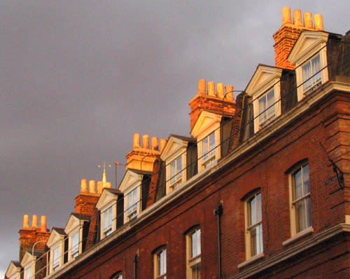

I'm sure Robert Paterson's trees looked even better when he actually saw them. So did these chimneys and this spire and this office block. Trust me.
Excellent piece by Bunny Smedley about the National Gallery Making Faces exhibition.
Bunny starts her piece with some reflections on the fascination that brand new human babies already wired into them for the faces of other humans, and not just the face of mum. I'm going to stick that bit up at my Education Blog.
Later she writes about a Goya painting:
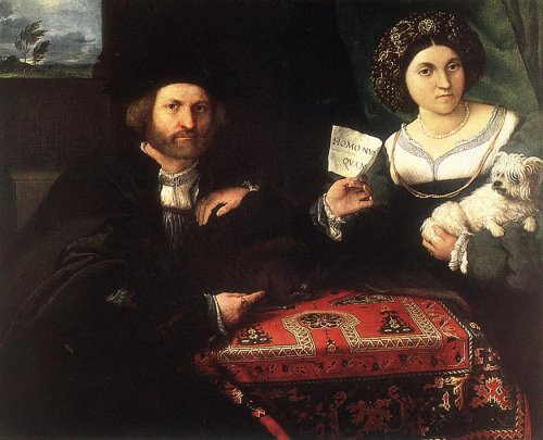
The distance between artifice and accuracy is one of the fascinating strands that runs through Making Faces. One of the finest paintings present – and, incidentally, one of the few genuinely capable of thriving against the fire-engine red walls – is Goya's magnificent Dona Isabel de Porcel. On one level, the work was a commissioned portrait of the wife of some long-forgotten minor bureaucrat. Yet if all it did was to represent her features accurately, why on earth should we care about it? But of course it does so much more than that. One doesn't have to take much of a leap of imagination to suspect that Goya enjoyed this particular assignment perhaps a little bit more than Dona Isabel's husband might have liked. Goya had, as do many men, a particular 'type' that appealed to him. Perhaps Dona Isabel approached it more closely than most. At any rate, what was meant to be a portrait has been elevated, here, into the stuff of full-bodied sexual fantasy – the slightly damp-looking curls, the flushed cheeks, the plump bosom only just encased within the black lace shawl, the remarkably full lips – and, most notably, those impossibly huge, luminous, indeed slightly bulging eyes. No one, frankly, has ever looked quite like this, which is perhaps just as well, because real life would render these exaggeratedly large and emphatic features freakish and unpleasant. As a fiction, however, they are stunningly successful. This is one of Goya's most perfect paintings, which is saying a lot.
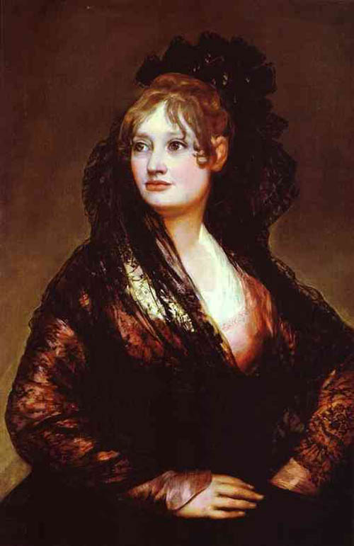
My only complaint about Bunny's comments on this painting is that she, or someone at the SAU Blog, might have included a link to the picture, so that we know the one that she's talking about. I found the picture here.
I've now listened to it again on the radio, and can report that Pinchas Zuckerman's performance of the Elgar Violin Concerto last Sunday at the Proms was fine, contrary to what I guessed at when I first half listened to it. There were occasional imperfections of tuning, and some of Zuckerman's phrasing was not quite to my taste, being a little too swoopy and glissando-ed for my entire liking. But it certainly wasn't the "mediocre" performance I thought I had half heard on the night. Quite the reverse. The Prommers gave it a loud ovation, and they were right to.
So, apart from the obvious, not listening carefully enough, where did I go wrong?
I think there were two things happening which had me confused about this performance. First, I think the sound on my TV is very unsuited to bringing out the best in the performance Zuckerman gave of this piece, and to performances of violin concertos generally, come to that. Digital radio, plugged into my medium-fi, was far better. By lowering the treble and beefing up the bass, as is my taste, I spared myself the scratches and hisses that often go with violin concertos, especially difficult ones with lots of vehement bow-hitting-the-strings-really-hard passages. Thus purified, the excellence of Zuckerman's performance sang through, past all the scratching and hissing I heard, or think I probably heard, on Sunday.
But second, I now think that I blamed the messenger for the message. Simply, I now believe that I like this piece less well than I told myself I liked it. I especially don't care for the first movement movement.
Listening to the radio this afternoon, once this thought had occurred to me, I realised how much more beautiful the orchestra tended to sound than did the violin. And whereas on the night I blamed Zuckerman for this (regarding the piece itself as beyond criticism), now I think I blame Elgar. All that scratching and scraping. How much more beautiful those orchestral legatos sounded, with their long and generalised string sound, with discreet brass and woodwind reinforcement to create that unique Elgar sound.
Notice that the quality I am complaining of in Elgar's solo violin writing is the very thing that my TV's scrappy sound system with its excessive treble and inadequate bass emphasised. All that frantic scratching and scraping. On the TV it was all an order of magnitude more scratchy and scrapy.
I listened to several other performances of this piece before hearing Zuckerman's performance again, as I promised I would, and none of them ,ade much of impression on me (although I did find myself admiring the one by Kyoko Takezawa with Colin Davis and the Bavarian Radio Symphony Orchestra on RCA). And I think it was the music I was failing to respond to. After all, if a young Zuckerman, a young Nigel Kennedy, Heifetz even, didn't work for me, it must be me and the music that are not in sync. With messengers like that, it has to be that the message itself is unwelcome.
Please don't misunderstand me as saying that you shouldn't like the Elgar concerto, or worse, that you should stop liking it on my account.
The slow movement and the final movement, with that long and soulful cadenza, are better, for me. And Zuckerman played those movements very well indeed, although again, with the occasional tiny blemishes of tuning and phrasing that would probably be redone in a studio recording. But if I had really been enjoying the music such things would not have bothered me. I would have tuned in to the wonderful things that Zuckerman was also doing, with what is, I know, for many many people, a wonderful concerto. Definitely my loss.
Is modern pop music just pop music, or does it subvert decency and undermine civilised values?
Here's a reason for corporations not to like the stuff:
The market share of Mitsubishi Motors North America, the United States unit of the Japanese automaker, has been halved in just a year, to 0.8 percent last month from 1.5 percent in June 2003, according to the Autodata Corporation. In June, the company's sales dropped 45.7 percent, to 12,301.Mitsubishi announced last week that it would lay off 1,200 employees, or about a third of its work force in Normal, Ill., site of its American plant, where it produces the Galant sedan, the Eclipse sporty coupe car and the Endeavor sport utility vehicle.
Mitsubishi has also decreased its advertising. For years it pitched the brand to young consumers with cheap financing and emotional eye-catching ads set to the music of Average White Band, Iggy Pop and Republica. That strategy created some of its trouble because it suffered a high default rate on the loans. Analysts say that Mitsubishi needs to write off about $1 billion in bad loans.
Don't get me wrong, I love pop music. Some of my favourite tunes are pop tunes. I'm not prejudiced. But the suggestion here, that pop music will attract the wrong sort of customer, suggests that there might be other reasons for the predominance of particular sorts of music – commercial reasons – besides the mere likeability of the stuff.
I can almost feel a neo-Marxist theory of musical taste coming on. The superstructure of musical taste reflects the economic infrastructure, that is to say, it is the consequence of the kind of business that businessmen need to do.
Of course, if you are touting for mere repeat business, where the trustworthiness and decorum of your customers is less of a worry and where you take their money continuously, pop music is just what you want.
But if you are selling cars or houses, stick with the classical repertoire. That way, they won't default on you.
I now want a critic, to tell me if Pinchas Zuckerman's performance of the Elgar Violin Concerto at the Proms on Sunday night really was as mediocre as I suspect it of having been.
Basically, I just thought there were too many duff notes and badly phrased phrases. Zuckerman's playing sounded to me choppy and ugly, in a way I certainly don't recall from having for many years owned Zuckerman's recording of this wonderful piece with Barenboim and the LPO. So, I switched off and did something else. I didn't switch off the TV set, on which he was playing. I just switched off my mind and ears.
Because of that, I have zero confidence in the satisfactoriness of my response, which could just have been wrong. If you want a critic to tell you about this performance, I am not it. Although this performance didn't grab me, that could be because I just wasn't in the mood to be grabbed, and if God had been the soloist I might still have allowed my mind to wander. I don't think that's what happened, but I really can't be sure. Maybe, for example, it was the fussy looking gestures of conductor Sir Andrew Davis (whom I have never much enjoyed looking at when he conducts) that also put me off.
The announcers and non-critical responders rounded up by the BBC to react to Zuckerman's performance had nothing bad to say about his playing, but they never do. They are there to accentuate the positive and make you keep on listening, and there is usually something positive to say about any half adequate performance. And then they talked with Zuckerman himself, and that was all about how wonderful it was to be playing Elgar in England with an English orchestra, and about how Zuckerman has to teach American orchestras how to play this music. He has, after all, recording this piece twice, and played it in concert halls all over the world, many times.
So now I find myself genuinely curious to learn if my casual impression matches with anyone else's properly considered opinion. Was it just me, or was this a decidedly imperfect performance? And I ask, because I truly want to know, the way most people who say "Was it just me or …?" are not truly asking.
Sadly, I can find no reference via google to anyone else's response to this performance, so here's what I will do. I will listen to that first Zuckerman recording, and to maybe a couple of other recordings, of this lovely piece. Then, I will listen (which may perhaps be more focussing than listening and watching) to the repeat of this concert that Radio 3 is broadcasting on Thursday afternoon. Much of the point of this posting is to remind me to do just this, despite the fact that there is a Test Match starting that day. And this time I will try to listen properly.
If no other critic will oblige me with a considered opinion of this performance, I will have to do the job myself. Assuming I manage to do this, I will report back.
But that's not my central point here. My central point is that concert reviewers do definitely have their uses. They educate the tastes of their readers, by either reinforcing their confidence in their judgements, or by undermining that confidence. Both processes are valuable.
Today I was in Oxford Street and spotted – and hastily snapped – one of my favourite things, this back of bus advert:

It's one of my favourite things because it combines three of my favourite things: Johnny Vaughan, London double decker buses, and the Erotic Gherkin. This is an advert for Johnny Vaughan's Capital Radio breakfast show, as you can see if you look carefully.
I'm trying to think of a new building in London which has been such an instant hit. The only other one I can think of which has been comparably successful is what began life as the Post Office Tower, and is now, presumably, called the BT Tower, although by now it could be something else again.
I can't help comparing these two popular hits with that lump out in Docklands, the Canary Wharf Tower, which impresses mostly because it is so big, but otherwise hardly at all. I've recently taken a couple of trips to Docklands. More about that when I've the time, and have mulled over the wording some more.
For another fine use of a bus, see the last of these pictures.
Category: Advertising • Architecture • London • Pop music • Radio
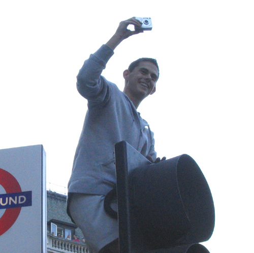
Last week I went to photograph a plastic rocket in Trafalgar Square, and you know me. I took some other photos. I really like tourists, now that I've found a way to exploit them, and most of these pictures are of tourists of one sort or another. In fact I rather think all of them are. Many are members of the Billion Monkey tribe. They illustrate many facts about the Billion Monkeys which are becoming pleasurably familiar to me, as I get to know them and their habits.
They keep their bags with them at all times. They don't put them down while photo-ing. On the contrary, the bags hang down in clutches, like ripe fruit, often from the same arm as is holding the camera.
The Billion Monkeys hold their cameras in a special way, and make remarkable shapes with their fingers. This is ensure that they don't get their spare fingers in front of the lens and spoil the picture. It comes of the cameras being so small, such that they can only be held between two fingers, which leaves the others either to get in the way or be held out of harm's way, as if holding a tea cup in Jane Austen world.
The Billion Monkeys hold their cameras out in front of them, so that they can see the picture they are taking on the little screen.
While they are taking their pictures they stay still.
There are no pictures here of any Billion Monkey groups all studying the same picture, like Soviet Workers all entranced by the same issue of Pravda in a propaganda photo, or like groups in old paintings gazing enraptured at the Baby Jesus, lit up by his divine light.
But the best thing about the Billion Monkeys is well illustrated by several of these snaps, which is that when they are taking their pictures they are so busy taking their pictures that they don't realise I'm sneaking up beside them until it is too, and on the whole they don't care even when they do realise it. I'm not shooting to kill, any more than they are.
Click on any square you fancy to get the big picture.


The little black girl and her dad were not using a Billion Monkeys camera. Theirs was a Real Camera, of the sort that required film to be wound on with a little handle. I know this because they asked me to take some photos of them with their camera.
I am aware that these pictures have many technical things wrong with them. Crowds of people are hard to frame, and/or crop satisfactorily. Inevitably, someone gets cut in half, and I don't like that. The light was beginning to fade towards the end, and several of them could have been better focussed. Objects in the background need to be very big or very small, either big enough to be one great big solid background, or small enough to be a patterned background, like wallpaper. In between sized shapes distract, and people behind someone you are photo-ing is often in between sized.
But I had a good time.
Today I got a DVD for next to nothing in a remainder shop, but a DVD with a difference. It was of a very good pianist (Zoltan Kocsis), playing some classical piano pieces.
One of the pieces was Beethoven's last piano sonata, Opus 111 in C minor. Maybe experts would find some faults with Kocsis' performance but I couldn't.
Watching him scorch his way through this amazing music made me realise that listening to CDs of piano music is a quite different experience from watching it being played as well.
When you watch a pianist at work, you know, a fraction of a second before it happens, what will then happen. When you see that right hand reaching out to the right and descending ferociously towards the keyboard, you know that what you are about to hear is going to be high, and loud. With a CD you have no clue as to what will hit you.
I believe that watching Kocsis' playing enhanced my enjoyment of it. It's almost as if your eyes are helping out with the listening. Your ears receive incoming data about what the music is doing, and so do your eyes.
This made me think of two other things. First, it made me remember a guy called Joseph Cooper, who used to appear on a classical music TV quiz show. One of his tricks was his "silent keyboard". He would play some piece on it, and all you could hear was a subdued clattering noise. What was the piece? Any real pianists watching this could always tell, and I often could too.
And the other thing this made me think that there is an opportunity here for a comic piano act, where the right hand descends with great ferocity onto the top end of the keyboard, and the comic pianist leans forward with enormous classical music type intensity toward the place of contact between his hand and the keyboard. But no loud high noise ensues, because Mr Comic Pianist pulls back from the loud noise at the last minute. Instead, his left hand, utterly unwatched by his intense classical music head, and hidden by his body as it leans forward with classical music intensity, plays a very low, very soft note. Maybe a Debussy type chord. The pianist turns in amazement to see what his left hand did. The point being that this is typically not what happens when you see a pianist play.
When you watch a conductor conducting an orchestra, you often know how loudly people are going to play, and who is going to play. But you don't know what they are going to play. You really don't know how it's going to sound. But with a pianist, you pretty much do know, just before it happens. As I say, this changes things. And it particularly changes things when the composer is late Beethoven, because with late Beethoven you never know what will come next. Unless, that is, you do.
I hadn't really taken all this in before. Well, it interested me.
I heard on the television this evening that apparently Charles Dickens invented the word "boredom".
Interesting.
I found this posting, about teenagerdom, and the comments attached to it, interesting. I was particularly diverted by this further reflection from the writer of the original posting, Michael Blowhard. Comments had veered into the adultness of film actors, and Michael said this:
… And how about manliness and heroism? They seemed to have a moment or two in the sun after 9/11, but we seem back to distancing ourselves from them again. I grew up an irreverent Boomer, thinking performers like Charlton Heston were a joke, for instance. All that squareness, that granite jaw, the posing ... It seemed to beg to be ridiculed and I was willing to do the ridiculing. These days, I find myself missing that kind of thing, and admiring the people who could once do it. The only kind of heroism we seem willing to swallow (in popcult, anyway) is cartoonish heroism, it's-all-a-big-joke-anyway heroism. Which I think is kind of tragic. These days I watch an early Heston movie thinking, Good lord, the fact that he was able to do that, with conviction, and put it over, and people were able to accept and enjoy it - why, that's really great! There aren't many performers who can do that today. I don't like Costner much, but I do find myself cutting him some slack just because he seems determined to do squaresville heroism. Doesn't do it very well, but credit for trying. …
 I agree about Kevin Costner, and actually like his acting rather more than Michael B seems to. Costner's problem is finding roles where what he wants to do is what they want done. I think one of his more successful movies weaving in and around these themes is Robin Hood Prince of Thieves>, which is all about the difference between stroppy rebelliousness and true adulthood. The Crusades, interestingly, are identified in that movie as a kind of adolescent tantrum, which ended in tears in the manner of a drunken teenage car expedition, but on a grander scale of course. However, while Costner is trying to be a serious grown-up, he finds himself up against a state of the art cartoon villain in the form of Alan Rickman's Sheriff of Nottingham.
Costner would probably be denounced at places like this as nothing but a wallower in political correctness. The anti-crusades stuff in Robin Hood plus the fact that in Robin learns about adulthood, maturity, etc. from a far more civilised black man. And of course there was Dances With Wolves and JFK. His constant striving after adulthood would get lost in the anti-PC complaining. But this would be a classic political box error. Political correctness is left wing. Trying to be grown-up. If you try to do both, nobody sees it because nobody wants to. Kudos to Michael for breaking out of the boxes.
Arts & Letters Daily links to an article which kicks off from a thought that has been close to my heart for some time now, especially the parking lot reference:
Many years ago, I was supposed to move to Los Angeles, but every time I went there, something about the light and space made me think that life was basically meaningless and you might as well surrender hope right away. I was still an art critic in those days, and I would drive from north-east of Los Angeles, where I was supposed to settle into my new suburban existence, over to the downtown museums, look at some art, and drive back. But when I got home I would find that the hours I'd spent negotiating freeway merge lanes and entrances and exits and parking garages was, in some mysterious way, more memorable than the museums. I was supposed to have a head full of paintings or installations, but instead, I was preoccupied with the anonymously ugly spaces that are not on the official register of what any place is supposed to be.Every city has them. Thinking about Paris is more likely to bring to mind the Eiffel Tower, or graceful rows of mansard-roofed buildings on chestnut-lined boulevards, than the long cement passages of the Métro lit by bad fluorescence and smelling of piss, or the dank passageways descending from cafés into Turkish toilets. Even national parks steer their visitors into an asphalted world of public toilets, parking lots, and thou-shalt-not signage, stuff that almost everyone is good at fast-forwarding past to the waterfalls and forest glades and elk doing ungulate things in public. Certainly a waterfall is more striking than the parking lot near its foot, but I wonder how it is that visitors can be so sure they saw what they were supposed to and so oblivious of what they were not.
Human aesthetic response is very strange. Very strange. One day, a totally different way of getting around to the automobile will be devised. Something involving jet-packs or helicopters or gravity engines that enable vehicles to travel the way they do in The Fifth Element (an architecturally fascinating movie, I think you will agree). And at that exact moment, all the automobile crap we now complain about – the motorways, motorway intersections, signposts, petrol stations, and car parks – will suddenly acquire the charm of a village made of thatched cottages. Those big and complicated motorway intersections will remain as great big picturesque ruins and be clambered over by tourists armed with whatever has replaced digital cameras. I mean, Spaghetti Junction has all the makings of a future Stone Henge.
By the same token, when thatched cottages was all there was, I'm absolutely sure that people went around saying: bloody thatched cottages.
Or to put it another way, as I once heard it put, as soon as pylons stop being put up and start being taken down, the Society for the Preservation of Pylons will at once be formed, and people will go out and spot them, the way they now spot steam locomotives.
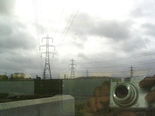
Pylons photoed by me from the train, in northern France, on my Brussels trip earlier this year.
Just to say, I watched all buit the beginning of a movie called Maybe Baby on Monday night, on the telly. Of this, the Radio Times (in the person one Jason Caro) had this to say:

For his debut as writer/directo, Ben Elton tries – and fails – to step into the winning comedy shoes of erstwhile Black Adder partner Richard Curtis (Notting Hill). Revolving around Hugh Laurie and Joely Richardson's attempts to have a child, this clichéd, caricatured and dreadfully acted tale has all the wit, sparkle and profundity of a 1970s Confessions movie.
… which is pretty much what I recall the critics saying when this first came out. But I found it quite entertaining and more than quite involving. In my opinion the problem was not the actors, or the script, but the directing. Time and again, what looks like bad movie acting is actually a bunch of perfectly fine movie actors doing exactly what the director told them to do, and above all doing it more slowly than their instincts would have dictated and than a better director would have demanded. This didn't bowl along with nearly enough zip, and time and again the acting was over-emphatic. But the script was fun, and once you had discounted the slightly leaden style, it was fun to watch. Yet the RT gave it only one star. When I think of the dross that they award two, three and sometimes even four stars to, I think this was overdoing it.
Could the fact that the odd spot of piss was extracted from the BBC by Elton's script be part of the reason for the animus against this movie among those who decide these things? I doubt it, but maybe. Although, it was shown on BBC1.
Tonight on BBC4 TV I was lucky enough to hear a snatch of Magdalena Kozena singing some songs by Novak (before incoming phone got in the way), at the live Prom they have just shown. She didn't look nearly as glamorous as she does in her publicikty stills, but she has a truly beautiful voice and made wonderful use of it this evening. I have CDs by her, but have never heard her sound so good.
Classical music on TV is often somewhat of a waste of all that camera work, but when someone is singing in a foreign language, the subtitles are a real help.
Later in the concert, however, there was an extraordinary moment, at 9.29 pm to be precise. Jiri Behlohlavek was conducting a very nice performance of the Prague Symphony by Mozart. Except that during the last movement the proceedings were jarringly interrupted by a plug for the latest manifestation of the rerun of Robert Hughes Shock of the New series, about Modern Art. And then it was back to the Mozart as if nothing had happened.
Imagine being the person responsible for a grotesque cock-up of this sort? And I wonder if any reference will be made to this interruption, now that the concert is over they are all clapping?
Here comes the same advert again. And now a voice says: "You're watching BBC4." Yes dear, I know, but do you know what BBC4 just did? It would seem not. Now they are showing a little programme about Bollywood movies. No apparent realisation of or apology for what happened.
A couple of emails from Adriana, making sure that I heard about this crucial technological development, and of this DIY version of the same thing.
If you are a Billion Monkey with a drink habit, follow those links. If the contents have made your camera unsteady, use the bottle to steady it again. Thanks to Boing Boing.
I've just started to watch American Splendour (no link – google your way there if you want to, but I'm busy watching it and I don't want to jeopardise the Purity of my First Response), and this is the first Definitely DVD movie to have come my way. By this I mean (a) you need to own it, and (b) you can't possibly get top value from it without regular use of the pause button.
Many of the early shots are of cartoons, and the editing went past them before I had time to read the captions. So: go back, pause.
Many of the frames make excellent pictorial decorl when paused. Here's what looks to be one of the key moments of the entire movie. This is when the central figure is first shown with a cartoon bubble over his head. Idea!!!

All good movies (and I rather think that this one is going to be very good indeed – one of my recent top favourites) about Creative Types seem to have one of those Creative Moments, when they Crack It. "You've cracked it!" says Mrs Pollock in Pollock, with some addition swearing if I remember the moment correctly, when Pollock finally gives up doing pictures of stuff and starts splashing and dripping his paint about, just like the real Pollock eventually did. "That's it, that's the sound", says Mrs Glenn Miller in The Glen Miller Story. It's the magic moment when our hero finally hits the trail.
What a splendid country America is. You get your chance to do this kind of thing. And if you succeed, they make a movie about you.
Actually, it turns out, maybe he's not a cartoonist, just the guy who did the words, while his pal Crumb takes it away and illustrates it. We're in the Restaurant. "Wow man. You'd do that?" Apparently so.
I'll keep you posted.
By the way. I did buy this, ex-rental. Sight unseen. Inspired purchase at £7.99. As Woody Allen says, the public just gets a feeling about a movie.
I didn't clock this new London building, by Daniel Libeskind, until today I found it while scratching through an old Guardian education section.
I will suspend any serious judgement until I've seen it in the flesh. Or in the steel.

Provisional prejudice: don't like the bad-mannered way I suspect it of joining the pavement. But that could be quite wrong. Maybe the pavement outside is nice, and bigger than usual, in a good way.
With buildings like this, a lot depends on the detailing, whether it looks as slick as the model did - if the model looked slick - and whether the detailing lasts, or instead self-inflicts all kinds of horrible stains, etc. I will photo it myself soon, and if I am still doing this in a couple of years time someone should jog my memory about it and make me go and photo it again.
I agree with the commenter that it looks like it's fallen over. But as other commenters say, the rest of the area is pretty dreary, and at least this livens things up. Yes, I rather think that will be my considered opinion. But I'll wait to see it.
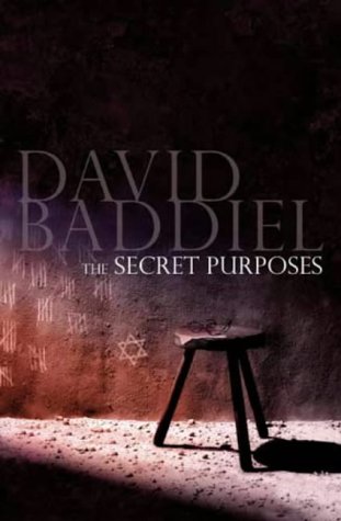 Richard and Judy, for the benefit of those cursed by having to live outside England, are a TV husband and wife act, and they now have an afternoon chat spot on Channel 4, which I often watch. Today, I caught them interviewing David Baddiel, who is better known as Frank Skinner's comic other half.
I sort of knew that Baddiel is some sort of book writer, but I didn't know that he is actually quite a noted novelist. Today, he was plugging – very interestingly – his latest novel, The Secret Purposes, which is about the many thousands of Germans, almost all of them Jews taking refuge in Britain from the Nazis, who were interned during the Second World War on the Isle of Man. All this was entirely new to me, I can tell you. Baddiel made it clear that the conditions they lived in were very benign, and in no way to be compared with the horrors of camps and ghettoes on the Continent. Indeed, he recounted that his German Jewish Grandfather, who was one of these internees and whose recollections got Baddiel started towards writing a story based in these events, was actually quite nostalgic for the time he spent there.
But the other interesting thing about all this is the way that Richard and Judy are doing an Oprah, and plugging books with their TV show. They were enthusiastic about this book, and this is bound to boost its sales.
From the far off days when there weren't nearly a billion of them. Katherine Hepburn in Summertime (1955).

Rossano Brazzo waits nearby, contemplating his moves.
No time for much today. But this rather bad tempered Guardian piece did at least tell me a name to google for, "Elizabeth House", which is to be erected just outside Waterloo Station.
Unfortunately, this is the only picture of what they have in mind that I have so far come across.
What a shitty piece of graphics! They could do better than that, surely. Maybe they have. Can anyone supply news of a better picture of this propose edifice?
Elizabeth House is the dark sticking up thing in the middle, and I do rather agree with grumpy Graham Morrison that this particular would-be icon looks like it will be a n ugly lump, but as I always insist here, appearances could well deceive. You never really know how it will turn out. And when you consider that Elizabeth House will replace this … well, at least there's a chance that things will end up looking better. This being one of those vile lumps that dates from the days when the last thing architects gave any thought to was getting the public to like their buildings and call them icons.
Meanwhile, anything they can do to sort out the mess of trying to walk from Waterloo Station to the South Bank will be steps in the right direction. At the moment you go through the (I think) vile Shell Building, past the vile sculpture in the middle of it, across an aerial walkway, which now, since they took the next bit of it down, just stops in mid air and you have to climb down off it.
As for Morrison's piece, which is an excerpt from a speech he gave to a bunch of other architects, frankly, it reads to me like one mediocre architect who is jealous of the architects who are better at making a splash than he is, and seeking support from a bunch of other mediocre architects. But that's just an impression. Anyone who knows more about this man, and knows that this impression of mine is wrong is welcome to correct it.
On the Friday before last, I attended the talk already referred to here given by David Carr at the Evans home, and present also was Amanda Oliver, who mentioned afterwards that she had written a review of The Barbarian Invasions. I missed this the first time round, despite having myself seen the movie and having enjoyed it and admired it a lot, and despite the fact that Amandas' review was linked to at the time by the Reason Hit and Run blog. Either that or I read the review but didn't clock that she was who had written it. Her piece is very good, and a model of what a review should be. That is, she tells you what she thought of it, but gives you enough information to be able to tell whether you would be likely to share her opinion. My Samizdata piece, by comparison, is a muddle. It started with how wrong some Guardian bloke was about the movie, and that, if present at all, should have been at the end. Live and learn.

That's Amanda Oliver on right. This is one of the best photos I've taken recently. The redness is real, not Photoshopped, the walls being all red, which means they turn all light bouncing off them red. I'm in it once again (which Scott Wickstein will like – see his comment here – although I'm probably far too easy to spot for his liking), and Patrick Crozier looks on, all unaware that he's in it too. Patrick and I are blurred, while Amanda is sharp (or as sharp as my camera and your screen can between them contrive) which is as it should be. Click on it if you want it larger.
If you find my relentless photo-blogging wearisome, you can, as stated in the bit linked to above, blame my friend Gerald Hartup. He made a point at that same gathering of telling me how good some of my photos are.

I wonder what he thinks of them now. Gerald has a most interesting face, and I always seem to get great pictures of him. That was taken on that same evening. With flash this time, which changes everything.
The Internet combines very well with partying, doesn't it? You go to a party, and learn of some interesting internetted item, and can google it as soon as you get home. Without the party you wouldn't have heard about it, but without the internet, reading it would be a nightmare of clumsy snail mail correspondence that would probably not be bothered with.
And now tonight, another party means that I need to post the picture of Amanda, because she will be there tonight again too. Having delayed posting it all week, I now have an excuse. Also, a reason, because she might have asked me tonight why I didn't use it (still might), what with emailing her to say can I?, blah blah.
The Barbarian Invasions is now out on DVD. I will buy it when its price comes down to a tenner or less.
The invaluable Arts & Letters Daily links to this piece by Ellen Winner about scientists who try to throw light, as it were, on the history of painting. Wenner makes it clear that some scientists do a far better job of this than others.
The successful one she writes about is Charles M. Falco:
When Charles M. Falco, a physicist in the Optical Sciences Center at the University of Arizona, presented mathematical support for artist David Hockney's contention that certain early Renaissance painters used lenses to project images that they then traced, he was greeted with fury and indignation by art historians. Falco's arguments were most widely publicized in 2001 in Hockney's extensively reviewed Secret Knowledge: Rediscovering the Lost Techniques of the Old Masters, and they were presented at a high-profile conference at New York University that same year with Hockney and art historians, but they can also be found in scientific journals.Still, even recently, when I've broached Falco's arguments to art historians, I've been greeted with surprise that I can take them seriously. The assumption seems to be that the claims have been shown to be wrong and can be dismissed. However, then I discover that the art historians don't even know the details of the argument. The devil is in the details, and understanding the exact science does matter.
The controversy over Hockney and Falco grew out of Hockney's discovery of a sudden shift toward naturalism in the 1420s and '30s in Flanders. Hockney claimed that the shift was too abrupt to have occurred without the use of optical aids that allowed artists to project images of the 3-D world onto a canvas and trace them. With the entry of Falco, evidence took the place of opinion. Falco pointed out that concave mirrors can serve as lenses that project images and that such mirrors were available as early as the 13th century. He went on to analyze anomalies in certain paintings that were consistent with the use of a lens and - most important - difficult to explain otherwise.
That last phrase is the key. Only if lenses were being used could certain errors be explained.
This is the painting Falco is talking about
I find this kind of thing fascinating. Partly, this is because I have an axe of my own to grind, or maybe that should be a lens. My concern with this is that the word "art" is, I believe, too arbitrarily assigned to certain sorts of creations, and denied to others, and that this has harmful consequences.
If something is said to be "art", a huge amount of admiring attention is focussed upon it. Young people are taught to admire it and to do more stuff like that. But if something else, on the face of it more admirably made and with a more admirable message, is denied the label of art, then an opposite thing happens. Objects that ought to be admired and an example to the next lot of creators – to the next lot of humans, for goodness sake – are instead allowed to sink into obscurity.
What has this to do with whether or not painters used lenses in the fifteenth century? Or to put it another way, why are the propositions of Falco and Hockney being greeted with such fury, assuming Winner is correct about that happening?
I think that it is because what Falco and Hockney are saying blurs the distinction between "art" and merely, you know, making stuff to sell. The painter with his lens suddenly looks a whole lot more like a photographer doing wedding photos or publicity stills than he did before. The painter with only a brush inserts his precious "feelings" into the object he makes, with every brush stroke, or so we are told. The lens man only uses a brush because that is, technically, all he yet has. Show modern photography to the guy who did this painting that Falco analyses, and he'd grab it.
My view of art, and of the word "art", is not dependent upon the correctness of arguments like those of Falco and Hockney.
Here is a guy who thinks they are wrong. He argues that the errors Falco says could only be the result of moving a lens could also be the result of the artist merely changing his point of view, while using the regular manual methods. But what matters to me is that this critic is not a regular "art critic", he's from an "eye research institute". He is looking at picture making in the same way, and arguing in the same way, that Falco and Hockney are doing, even though he reaches different conclusions. He takes their argument seriously, and is perfectly happy to discuss the matter scientifically.
The point is: do you see this huge gulf fixed between image makers and thing makers (painters and sculptors) of one sort - of the "artistic" sort - and other sorts of image makers and thing makers (photographers and industrial designers and manufacturers of stuff)? To me, there is a continuum, with old style painters very much in the thing making industry, before they had things like printing and photography and giant machines to mass produce. But their attitude was much the same as that of these later thing makers.
If, on the other hand, you think that mass production is a crucial difference between art and mere stuff, someone tell Charles Dickens, and the rest of those printed book writer guys. I end by flying off at somewhat of a tangent, in the form of another Arts & Letters linked article, this time about what might happen next to the novel. Pictures are involved in that also.
Two movie reviews you might want to know about. First, Alice (now in Texas) reviews the Kill Bills, for 2 Blowhards, no less.
And strictly second, yours truly saw School of Rock last night. More entertaining than educational, but at least entertaining.
Two pictures. The first, on the left, which I took a few hours ago, is of my lemon squeezer. This cost me - what? - about a quid? And on the right is world famous designer Philippe Starck's world famous redesign of the same object.

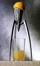
It's a brilliantly appealing idea, but apparently the thing itself doesn't work very well. I'm guessing that the juice doesn't go quite where it should, that, for example, it goes down the legs as well as down from the point in the middle) and that the pip problem is … a problem. My one may demand a two stage process, but it does the job.
But the price of the Philippe Starck Lemon Squeezer is right, i.e. very high, and lots of people buy the as an art object, confident that lots more will be frightened away by that same price, and presumably also by the fact that as an actual lemon squeezer it is unsatisfactory.
With my Intellectual Property hat on, I ask: is anyone else allowed to take the same basic idea and try to make it work properly, and if not why not? And while they're about it, to lower the price? Do they have to ask Philippe Starck's permission?
In general, what is the fate of brilliant ideas, badly exploited? Great scripts, abominably acted or directed, with hideous camera work? Great concepts for tin openers, that could open tins brilliantly, but which actually don't because that extra bit of work that should have been done wasn't done?
But there is no denying that Starck's Lemon Squeezer is very elegant, in an Invaders from Mars in a fifties film kind of way. But is it really just a piece of sculpture, that merely looks like it could squeeze lemons? (Later in the evening, Robert Hughes made a similar point about that famous Rietveld chair. It may look like a chair, he said. But after carefully sitting on it, he declared it to be sculpture.)
I learned about this Lemon Squeezer because there was a TV show about Starck on BBC4 TV last night.
Good designers, said the Hostile Talking Head talking about Starck on the telly, do ordinary things extraordinarily well. Starck does extraordinary things, but rather badly.
They showed some Starck designed hotels. I hate hotels. Starck's hotels look to me like hotels only more so, so I assume that I would hate his hotels even more. They are like James Bond sets, of the "sophisticated" sort, where gambling takes place and where Bond says things like "Bond. James Bond." Except that they are even more kitschy and decadent and hideous.
The Hostile Talking Head said that these hotels photograph better than they work as hotels. The presenter is called them super-elitist, and ultra fashionable, and added that there's nothing so unfashionable as an ex-fashion.
Hostile Talking Head: the best design is like the best English butler. It's always there, but you don't notice it.
Starck, you notice. What he truly excels at, the Hostile Talking Head had said, in his first sally of the programme, is self promotion. I know this because they're now showing the programme again, and I can inform you that the Hostile Talking Head is Stephen Bayley. He's quite a good self-promoter too.
I'm turning over in my mind an introductory essay about How To Be One Of The Billion Monkeys, which will probably end up being called something less cleverly cryptic and more helpfully informative, like: What I Have So Far Learned About Cheap Digital Photography. I don't plan to do much in the way of introductory reading of rival essays in a similar vein. Plenty of time for that later. But I did check out this guy. (I did a Samizdata posting a while back linking to his brilliant photos of SpaceShipOne.)
I found my way quickly to this essay, which lead to this further essay which included an enticing link to a piece on airshow photography. Follow that link, and you get to this ultra-cool photo:

This man knows what he's talking about. Wow!
He starts what he says about airshow photoing thus:
The only special piece of equipment which is required for airshow photography is a long lens. You don't need an auto-focus camera and you don't need image stabilization or vibration reduction, but if you can't fill the frame with the aircraft then your photos will lack impact.
You got that right mate. I love airplanes, and London has a constant supply of them, on their way to land at Heathrow or taking off from the airport in the City. I keep photographing them, and they keep ending up either like insects crawling across huge deserts, or, if I zoom in close with Photoshop, like the work of a spy in a great hurry. Far too blurry, that is to say.
Which illustrates one of the points my Big Essay will probably contain, which goes: get a cheap camera first, and use it to learn, and in particular to learn just what sort of more expensive camera (which itself will be as cheap as your first one in a few years time) you should be getting next.
My next camera will have a lens enabling me, provided the price is right, to photograph the Great Wall of China from the moon.
And this really isn't very cultural at all, but I'll say it here anyway, namely: I'm coming up in the world.
This posting, linking to a Samizdata thing I did yesterday about where oil comes from (if you're interested don't miss the comments because that is where the real argument is argued, by people who actually know what oil is), has me number two in a list of four writers linked to.
Writer one is Charles Krauthammer, writer three is James Lileks and writer four is Victor Davis Hanson. I am strictly fourth in this company, because you wouldn't catch any of these three boasting about being in a list involving the other two, and me. But even so … score.
This reminds me of when I subbed a couple of times for David Starkey (i.e. as one of the in-house interrogators) on the Moral Maze.
The thing about social climbing is that when you are a low-to-middle ranker, then if you want to socially climb, you probably need forget worrying about being seen to be socially climbing, because you probably will be. So, just do it.
One of the world's more annoying things is those extremely grand people who don't have medals or wear fancy uniforms, and who are tremendously gracious to "ordinary" (which gives the game away) people, and who imagine themselves to be above social climbing, or who are sold to the world by their devotees as above social climbing, just because they don't wear a suit and a tie or a chest full of stupid medals or make sure everyone calls them Sir Blah Blah, if Sir is what they are. Bollocks. They are just at a different level, the posh bit nearer the top where low-to-middle rank social climbing like I just did isn't how you get higher any more. i.e. where they are competing with other grandiosities like Lenin or Gandhi or Mick Jagger. You can bet that when they were still hussling their way up out of the huddled masses, they hussled.
 Another "culture means what I say it means" posting.
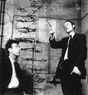
While concocting a posting (it will appear tomorrow – link here when it does) for the blog that pays me, I came across this famous photograph, and in a particularly clear version (often it is very blurred), here.
I put in my posting that how Crick and Watson communicated their DNA idea didn't matter. It was enough that they got it across somehow.
But I wonder. There is something very beautiful about a helix, and all the more so when the elements that go to make it are complicated and cloudy and confused. The essential helicalness of the combined object is then all the more remarkable. Complexity leading to simplicity, blah blah. I wonder how well Crick and Watson would have done with such primitive modelling technology had the shape they were chasing been less simple and elegant. Try googling for images of "protein". See what I mean?
Well, I don't know. This is really just an excuse to stick up that picture.
Has anyone redone this, and redone it better, as an oil painting? It would make sense if they did. Here is a clue to what that might look like.
Architecture is difficult. I keep saying that. And I keep saying it because it is true.
You produce really cool pictures of how it will look, but you never really know how it will turn out.
Take the London Assembly building. The Man Behind the Gherkin was also the man behind this, and you all here know that I worship the Gherkin more than life itself.
The London Assembly building, on the other hand, seems to me to display a definite diminution from vision to result, from imagination to execution.


On the left is a 1999 publicity concoction, which I found here and I think it looks really great. Like a really expensive headlight on a really expensive car. And notice that at this stage it sticks out over the river, rather than just parked down beside it.
The picture on the right is attached to a January 2003 Guardian story (where the whole Ken Shuttleworth really did this thing is gone into. Can that be the thing itself? No, I think that's another projection of how it's going to look rather than how it really does look. And whereas it doesn't look as cool as the first picture, but it still looks moderately ool. It's not a really cool car headlight. More like an alien egg. But still, as I say, cool. Ish.
And then we have the thing itself, photoed by me a week or two ago.
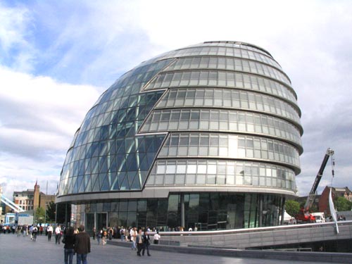
To me, this looks ever so slightly like a lump of clay on a wheel, slapped down, and not yet straight. Worse, when you are actually there, the curvedness of the floors makes you think it's all leaning over. And something very bad has happened to the ground floor. It ought to curve into the ground continuously. This thing just sits of a plinth that is too small for it. And unlike the bottom of the Gherkin, lots of people get to see the bottom floor of this thing.
Got it. I think I know the big thing wrong with this, looking at it some more. The problem is that it doesn't start out at the bottom by curving outwards enough. At the back, it still goes out a bit, but this is the big difference between the early pictures and the final object, and that is what makes the final object look so comparatively uncool, or, in English, more earthbound.
Plus, I think maybe this is an object that looks its worst when you look up at it from ground level, as I did with my camera, and as the first two pictures above do not. The first looks down on it, and the second looks at it sideways, but not up.
And what's that ziggy zaggy thing about, with the windows at the front. The original headlight effect was far better, I think.
That's how it looks to me, anyway. Of course, if you like it, I'm happy for you, and I'm only judging this thing by the highest possible standards. What I'm saying is: the Gherkin it's not. (For starters it isn't nearly big enough for the curvey style to really work well.) But what, apart from the Gherkin, is the Gherkin? The London Assembly building is still a fun addition to the riverside. Politically … well, that's another argument.
I mean, at least it isn't this Palestra thing, which seems to me to have given up even trying to be interesting. The website is as cool as it's ever going to get, I'd say. Although, the fact that the early pictures can be wrong could be good, with the final object turning out much better than the pictures. But if that happens here, I will … be surprised. Either way, I'll show photos of it here when they finish it.
 I did a posting today at my Education Blog about , and some of its lyrics, and picture of the cover of it didn't load properly. Also, the design was ungainly. Small pictures to the right do not mix well with a song lyric. So now I'm trying it here. If there is no picture here either, that means it failed again, and you can ignore this, which you probably would have done anyway.
Well, it seems now to be working. Very odd.
Just to fill in a bit more space, does liking Bernardette Peters make you (by which I mean me) gay? I shall continue to like Bernadette Peters anyway, but would like to know what conclusions people are going to draw from this.
There's a new season of Proms starting this Friday. Last year I went to a prom, and heard Esa Pekka Salonen conduct a performance of Beethoven's Ninth Symphony which combined being note perfect with being completely boring. In fact it was the most boring performance of a Beethoven symphony I have ever heard. While it was happening I thought: is it just me, or is this very boring? Then, next morning, I read the critics, and they found it very boring too. So critics do have their uses.
However, ever since that boring performance, I have had something of a phobia about this piece. Perhaps Beethoven's Ninth Symphony itself is boring, I found myself saying. So those critics didn't do a complete job for me. I have listened to the occasional CD of this piece since then, but you know CDs. They all have a tendency to be note perfect and boring too. With a lot of music note perfect is good. But with Beethoven's Ninth it means you aren't trying.
 And then, today (yesterday by the clock), I finally experienced the cure, in the form of this fabulous BBC recording of a live – and how! – performance of this might work conducted by the late Klaus Tennstedt on September 13th 1985, also at a Prom.
This performance is everything that the Salonen performance was not. Tennstedt makes everyone play and sing as if their lives depended on it, and every note means everything. I put it on after breakfast just to hear what it sounded like and an hour later I was conducting the finale as if my life depended on it. For once, all that solo singing at the end didn't sound absurd, with the tenor Robert Tear sounding especially fine to my ears.
This grump didn't like it, and moans about the accoustics. I thought the accoustics only added to the drama of it all.
This guy, on the other hands, seems to have liked it a lot:
Voici la présentation des sept dernières parutions. Surprise majeure, avec une exceptionnelle 9e Symphonie de Beethoven par Klaus Tennstedt, avec le London Philharmonic le 13 septembre 1985 et, en solistes, Mari Anne Häggander, Alfreda Hodgson, Robert Tear et Gwynne Howell. Il s'agit d'un concert bouleversant, à peine entaché par quelques flottements orchestraux dans les 2e et 3e mouvements, où tout converge vers un finale électrique, avec des chanteurs galvanisés par la baguette de Tennstedt …
My French is very approximate and I'm not sure what those "flottements orchestraux" were in the second and third movements. But isn't it good to know that in France they conduct their symphony orchestras with baguettes?
I'm sure the same thing is happening here. And how could I possibly complain? Literature is conspicuous here by its absence.
The populace of the United States may be divided by race, age, gender, region, income, and educational level. But according to a report released on Thursday by the National Endowment for the Arts, there is at least one thing that brings us all together: No group reads as much literature as it once did. If present trends continue, our aliteracy will only deepen over the next generation. After all, the steepest decline in reading has occurred among young adults, ages 18 to 24.
I don't think this is scandalous. I just think it's life. The question is not: why is this happening? The question is: how come it took so long? I mean, if you spend an entire century perfecting how to tell stories in the cinema, and then in the living room with domestic cinema machines, why would you expect everyone to carry on reading literature as if nothing had happened?
To me the surprise is how many, many people do still love to read.
Another from here:

Go here for the same thing slightly bigger, which is worth doing.
I suppose that when this was first exhibited, I would have disapproved. Call that a painting? Now, of course, beaten into submission by later horrors, I like it. Now, the very quality that at first made this painting so abhorrent to majority opinion (insofar as majority opinion ever set eyes on it) is what now makes it popular. I'm talking about the way that it is so obviously painted – so obviously not a photo, as we would say – while yet contriving also to look like a landscape. This is a mountain – this is not a mountain. Above all: this is not a photograph of a mountain.
Recently I had a go at retaking this picture without the pink sky, in other words with the new camera.
There was a beggar sitting on the exact spot where I took the first photo from, so I shifted to one side, which may even have improved matters. The best shot, I think, was this one:
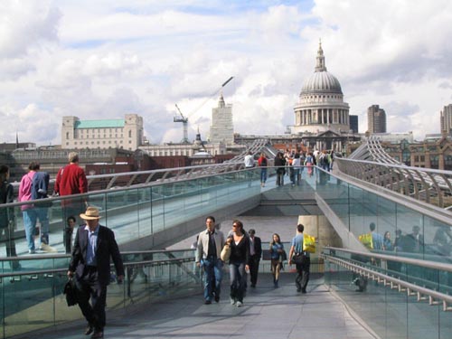
St Pauls has come out much better. And the way the central figures are lit, it almost looks like one of those oil paintings, the justification of which is that the camera could never do that.
Click to get a bigger version.
 Over on my Education Blog I have just posted the kind of posting that makes me wish, sometimes, that it was just Brian's Blog, and think, sometimes, that it ought to be just Brian's Blog. It's about the education of musicians, and is based on a snippet from a book by Susan Tomes, the pianist (now) of the Florestan Trio, and (formerly) of Domus.
The villain of the posting is Sándor Végh. I mention him because in addition to finding the photo of him over there, I also found the photo here, which is very striking I think.
Last night I was out and about and my friend Gerald said nice things about my photos. So here is another photo, which I took on the way to where I was going. As often happens, the very first was one of the very best.
In the first version of this posting I stuck this picture up exactly as it emerged from the Flash Card, but looking at it again, I decided on a little juicing up of the contrast. This does actually make it look more as it looked for real.

Magic hour lighting, yes? And look! At the bottom, on the road, that's me. I guess that for lots of Real Photographers that would be a no no, but I love that kind of thing.
Click to get it bigger.
Don't miss this work of art at Samizdata.
But, be aware that this hippo breaks the biological rule that the Angel of the North obeys, that is to say, it has wings and front legs.
That may be your lot for today. I am shortly leaving, to attend a talk by David Carr about intellectual property, at which I am hoping to learn a lot.
So, did Samizdata have permission to reproduce the hippo? And who thought of the idea of a winged hippo first?
This building, as previously noted here is now growing steadily:

This one could be a stunner, or it could be rather mundane. Can't wait to see.
I could probably afford the occasional trip to the theatre, but the prospect does not appeal. And what definitely does not appeal, because this I definitely cannot afford, is to acquire the theatre habit.
But for those who would appreciate regular theatre criticism from an elegantly conservative viewpoint, there is now Professor Kenneth Minogue to turn to. He is now this blog's theatre correspondent.
Here's a taste of his recent review of a recent Globe Theatre production of Much Ado About Nothing:
Thespians in Britain have long since taken up a moral doctrine in which the identities of actors must be subordinated to a generic humanity. By something like a kind of brainwashing, we are to be trained barely to notice and certainly not to respond to the physical identity of the actors. This may be politically admirable, but it makes for terrible Shakespeare, and often for feebly spoken verse. Physical details are important. Falstaff has to have a pillow in his belly, Helena must be taller than Hermia, and a Richard III calling 'A horse! A horse! My kingdom for a horse!' from the turret of a tank (as happened in a recently film) cannot but bring one up short. The effect of this kind of political correctness at the Globe is just to make its performances look like end of term productions.
The polite but deadly skewering is a Minogue speciality.
Picture of the skewered production:

A quibble though. Is Minogue perchance referring to the (relatively) recent Ian McKellen film of Richard III? Maybe he isn't. But if he is, then that line was – according to my recollection – spoken not from a tank but from a jeep, the wheels of which were rotating futilely in the mud. Richard's cry sounded a little odd, but not illogical. A tank was (memorably) involved at the beginning of this movie, when a tank smashed through the wall of a library, again very effectively. In general, I loved that McKellen Richard III. Cursory googling reveals no Richard III movies since that one.
If it was another movie that Minogue was thinking of, my apologies. If I'm right that it was this particular Richard (and that it was a jeep) then the point that Minogue is making is still a good one, even if imperfectly illustrated.
Later: yes. I have the McKellen Richard III DVD. I checked. It was a jeep. But the wheels were not stuck in the mud. The jeep was just stuck futilely over a concrete overhang, denying the back wheels any purchase on the ground beneath.
Welcome to the blogosphere, Professor.
I love this picture, which I found here, via this, while composing this.

Point your camera at the sun and let the light refract in the air on its way to you, dusting the distant objects with light that you see but which never did anything to them (if you get my meaning). It never fails.
 This picture has been sold at Sotheby's for £14,500,000, so Channel 4 News has just informed us, moments after it happened.
It's a Vermeer, "Young Woman Seated at the Virginals". But apparently it's not a very good Vermeer. Originally she was wearing a different shawl. Dear oh dear.
The thing about the art market is that the price reached by a painting is the price that the second most extravagant art lover in the world on that day is willing to pay, plus a little bit. It takes two, baby.
Vermeer, by the way, is the man whom Colin Firth played in Girl with a Pearl Earring, which has just come out on DVD.
At present it is in Blockbuster for £19.99, I think it was. But it will soon come down.
Two people willing to pay anything to buy a DVD does not a DVD market make. It takes more than two, baby.
My name is Brian and I am addicted to classical music. So far so good. Nothing wrong with that. But my name is also Brian, and I am addicted to classical CDs. Not quite so good. But we classical CD addicts can give ourselves a fix from a fixed collection. We can handle it.
However, my name is also Brian, and I am also addicted to buying classical CDs. Bad. What that means is that at the moment of discovering the bargain I get an adrenalin rush of joy, quite distinct from any adrenaline rushes I might later get from actually listening to the thing.
Luckily for me I am only addicted to buying bargain classical CDs. Buying a full price CD is something I only do about once a year, and any adrenalin rush associated with that is entirely the result of listening to the CD, never merely with the buying of it. But there are an awful lot of bargains out there these days.
 Yesterday I found this CD in a bargain CD shop, at way less than what the record company is asking. Serkin playing Mozart piano concertos 19 and 20, both wonderful pieces, both wonderfully played. Serkin was still at the top of his form when he made these recordings, which he wasn't by the time he recorded some more Mozart piano concertos for DGG.
Mozart's Piano Concerto number 20 is famously fine, but number 19 is wonderful too, and this was the recording by means of which, in the long gone age of vinyl, I got to know it. 19 is unusual in that it has a dance type episode in the middle of the last movement, involving a different tune to the regular tune, not unlike the comparable episodes that occur in the finales of Beethoven's first two piano concertos. For some reason Mozart had never done this in a piano concerto before – same speed, different tune –and never did it again, although Number 20 has a fast outburst in the slow movement, and Number 13 (I think) has a slow passage in (I think) the finale.
I get the biggest adrenalin rush of all when a favourite LP from long ago, which the record company has ignored for decades, finally makes it onto CD, and I find it going cheap, in a carboard box, sold by a fat sweaty man in a white T-shirt with strange messages on it, who knows nothing about classical music and doesn't know what a bargain it is and how much more he could have charged me for it.
I was in the West End of London this evening, and the whole place was bent completely out of shape by some Formula One car parade.
According to this report …
Around 200,000 fans watched as the drivers and other F1 stars raced their cars along Regent Street, one of London's most famous shopping areas.
Well, this particular "fan" never set eyes on any racing cars, although he did hear a few making deafening revving up noises. However, he did realise that this was a happy hunting ground to snap a few more of the Billion Monkeys in action.
Sure enough:


Snap snap. Vroom vroom.
Damn. I just missed this:
The Gadget Show
This is Channel Five, by the way. This evening, 7.30 pm.
4/10. …
That means it's the fourth in a series of ten shows.
… One of the current "must have" items, the digital camera, is put to the test as Suzi Perry compares its photos to those from a 35mm film camera. Tom Dunmore recommends the best digital models on the market.
I'm putting this up here not for the edification of my readers. You are all, let's face it, edified enough as it is. No, it's for me. The show will be repeated at 9.25 am on Wednesday morning, and by typing this in I increase my chances of catching it then, or at the very least setting the video for then.
Here's a picture of some people who are quite happy with what they have:

…complete with a moving car in the background. This is an effect which I particular like.
I've been enjoying this rather odd disc. It's another Naxos, this time of Brahms chamber music for strings, but re-arranged (by Brahms himself) for two people to play on one piano.
Time was when this was how musically educated people typically enjoyed their music. Untypically, they would hear the occasional concert with a symphony orchestra and a famous conductor. But that was very rare. Meanwhile, the family hi-fi was the piano, played by one of them. With others joining in with singing or on other instruments.
Four handed piano arrangements of pieces that only an orchestra could do real justice to, or, as in this case, only expert string players, were thus, before real hi-fi, a staple of the music business. And such is the state of the music business now that it makes as much sense to do the first or second recording of a couple of these four-handed piano reductions as it would to do yet another recording of the real things.
 The particular CD I've been listening to is of Brahms String Quartet opus 67 and of his String Quintet opus 88, played on the one piano by Silke-Thora Matthies and Christian Köhn. Are they, like so many of the people that this music was first re-arranged for, a husband-and-wife team? I don't know, but they have been playing this kind of music together since 1988.
As I said, I've been enjoying this disc, but not quite as much as I had hoped to.
To my ear, there is just a tad too much of the feeling that these people are not so much playing this music, as playing through it. In the quicker and rhythmically strong bits, it sounds find. But in the slower bits, you really miss those long legato lines, and it sounds not so much like a performance as like a run-through. The long lines of the piece, instead of flying slowly forward like hovering birds, snap apart into disjointed little tinkles and fall to the floor. Thus it is that, in the slow bits, it sounds that fatal little bit like expert sight reading. What I heard was two musicians contentedly and expertly acquainting themselves with the facts concerning what the notes are. What I wanted to hear was a true performance.
It sounded to me, in other words, much as it must have sounded when this music was first played, by its first customers.
I would really love to listen to a disc of two of the following doing this kind of music: Murray Perahia, Radu Lupu, Andras Schiff, Mitsuko Uchida, Alan Schiller, or maybe Evgeny Kissin. Or: try Benjamin Britten and Sviatoslav Richter. This music, arranged this way, needs people to play it who are better than it is. You need pianists who can dust onto it that bit of magic that expert string players routinely bring to this music. It needs pianists who can caress magic out of a keyboard. Matthies and Kohn are, for me, just that tiny little bit earthbound.
I want to qualify this strongly. Matthies and Köhn are excellent pianists. All I'm saying is, they aren't quite at the very top of the tree, and that their performances of this music made me want to hear it played by a couple of pianists who are. I can imagine many listeners singling this disc out for possessing the very quality that, for me, it didn't quite possess. For many listeners, this CD might have just the magic which, for me, it didn't have.
I bought the CD - second hand and for even less than the Naxos price of £5 - to hear what this stuff sounds like, and to get to know these pieces (two of my very favourites) that little bit better, by hearing them dressed differently, as it were. This I definitely succeeded in doing.
Another picture from here. (And they really are very, very good. As I said in my previous posting about these, I strongly recommend rootling around.)
It's The Death of Socrates by Jacques-Louis David.

I love the certainty these old guys had that their pictures were the best pictures there were. There was no complicated excuse-making about how painters see more than photographers, photographers see only the surface, etcetera, because the photographers weren't doing it yet.
No time for a real posting, so here's a quota posting, of two more of the Billion Monkeys, comparing their Billion Monkey Machines in the Underground.

I could be quite wrong about this (and if this blog comes to a sudden standstill this could be the sort of reason why), but I had the definite sense that all the other passengers felt that whereas a Billion Monkey taking photos of regular people in the tube would be outrageous, a Billion Monkey photo-ing other Billion Monkeys is not a problem.
Of course, it helped that I truly believe they had no idea what I was doing.
The (very nice looking) woman right opposite me saw it all, of course. She was smiling. (And you'll just have to take my word for that.)
This posting tells of the serendipitous path I followed to this, which looks like a really excellent collection of paintings. What all the pictures seem to have in common is that they are all really well reproduced. You don't, I believe, get everything, but what you do get is very, very good. None of those poky little postage stamp blurs you find with googling for images. Ideal if you want a virtual stroll around a fine virtual art gallery, but I should guess (but what do I know?) maybe not as good for finding a particular painting.
I browsed my way to this really strange picture:

To me, it looks not so much like a real group of people as a collection of cut-outs, just jammed together. A collage, in fact. It makes me think of that book and TV show that David Hockney did a few years ago, arguing that they knew a hell of a lot more about photography in centuries past than is generally assumed. Only the final step was painted. Everything up to that point was done by projecting a photo-like image onto the painted surface, as happens inside our cameras.
The reason I say that of this painting is that each individual figure is brilliantly executed, but the fitting of them together looks like a muddle, to me, if only because they throw no shadows upon one another. The one on the top right looks especially cut out and stuck on, don't you think? What we're looking at here is early seventeenth century Photoshopping.
But (reprise) what do I know? If I'm wrong, feel free to instruct me. When I say how old paintings look to me, my ego is not on the line. Comment at will.