

Busy day, so instead of proper blogging, more stupid photos of things reflected off a shiny surface.
This was the big picture:

And here were two little pictures I took of myself. Click to make them bigger.


My poor little camera was set on automatic, and it had a hard time deciding what to focus on, but it did okay, I hope you agree.
This mighty, shiny, machine was and as far as I know still is parked outside a shop in the Kings Road that sells things like Harley Davidson handbags and Harley Davidson deodorant. Or I think that's what it sells. To be honest (my sister said to me when last we met and I used this expression: "Does this mean that normally you aren't?") I didn't look, on account of not caring.
And yes, I have had a hair cut. I do not need to be told this. I was fully conscious at the time, and I myself paid for this to be done.
Another photo for Tatyana's son (see comments here). It's the same car. But the view is slightly different, and the leaves on the trees have now gone.

Click to get the same thing bigger.
Just under a year ago, on Monday December 8th 2003, the triumphant England Rugby Union squad paraded the Rugby World Cup which they had won the previous month, against Australia, in Australia.
I found the final almost too painful to watch, and even now I can hardly bear to watch the DVD I now have of it. England should have finished off Australia an hour sooner, but they just couldn't, and in the end only Wilkinson's famous drop kick at the death won it for England.
So for me, the big thrill was not the final itself, but the celebrations in London, which I watched on the telly. This brought two of the things I have most enjoyed looking at during my whole life, the England rugby team in all its many variations, and the great city that is London, ditto, into one grand jamboree.
You can find far better photos, technically speaking, of these celebrations than the ones I took, but here are mine, which I snapped in a technically ridiculous fashion which I am sure was unnecessary, with my newly acquired Canon A70, of the digital TV coverage of the celebrations by the BBC, which I did not (and still do not) have the technology to record properly. (The only telly tapes I have are still of much inferior analogue reception.)
I couldn't even pause the pictures to get them less blurred.
But I love these photos. They capture a moment in the life of my country and my city, and of my own life, in a way which will surely never happen in the same way again, even if England win the next Rugby World Cup and parade that around London also, as is not impossible. For by the time of the next World Cup, I will surely have some means of digitally recording digital TV, and quite possibly I will by then have worked out how to capture such imagery on my computer, with some kind of card thingy or something. This, I feel sure, is what everyone else except me does already.
But for me, the technical bizarreness of it all only all adds to the fun, and it adds even more to the atmosphere of these pics that I think I started snapping away at the telly pretty much on the spur of the moment, having never tried doing this before.
All part of the oddity of them is that it has taken me so very long to finally get around to sticking them up here, the excuse being that it was a year ago. Also, today, at Twickenham this time, an almost brand new England side is playing against Australia.
Anyway, enjoy them, skip in among them, get the picture with one picture and move on, ignore them, scorn them. In short, treat this like any other brand-X blog posting. But for me, these will be a diary entry to treasure.


As you can see, the Billion Monkeys were out in force, many of us, it turns out, being England rugby players. My favourite Billion Monkey shot being the very first one here (which I'll call 1.1 – first row, first from the left), of Josh Lewsey, seen from above, photoing the Cup itself.
2.2 preserves in photo form all the clobber that surrounded my TV set at the time, and is one I will therefore particularly enjoy. And speaking of irrelevances, I especially struck by an individual I had completely not noticed at the time, namely the little blue guy whose job was to see that the Cup itself came to no harm. See especially 3.2, but he's in others too. What a day he must have had.
3.5 is a classic heroic shot from street level of Richard Hill on the bus, breathing it all in and making sure to savour these magic moments, with Jonny W for once rather spoiling things. And although 4.4 is very blurred, it gets Dallaglio very well, I think.
4.1 is another classic Billion Monkey pose, this time of the guy you have asked to try his best to do one of you with your camera. Jason Leonard is having fun, but he wants to get it right. And 5.1 is another generic Billion Monkey shot, the one where the Billion Monkey fiddles with the nobs in a somewhat puzzled way, with the strap hanging down over his hands. That's scrum half Matt Dawson.
In 5.2 and 5.3 we observe a veritable Billion Monkey Troop in full capture mode. A cameraless Mike Catt looks like he swallowed all the cream in England, but maybe Jason Robinson wishes he'd brought one of these camera thingies with him too, like all the other guys.
And who is that, just about makeable out in 6.1? Why yes, it's Mayor Livingstone! And quite right too. London needed to shake hands with these guys officially, and he was the man to do it. He did it well, not trying to barge in on anything, just making sure to be there, at the side.
There's even an artistic one, 7.5, and 1.4 is in a similar vein, with stuff flying through the air past the bus. And 5.6 is pretty artistic too, of the cup itself in reasonable focus and almost everything else blurred.
And through it all, the dominant personalities of the occasion. Captain Martin Johnson (4.3, 6.2), Head Coach Woodward (perfectly focussed in 4.5, then distracted away from the interviewer in 4.6), and Jonny Wilkinson (7.4 is especially good). And of course there are lots of pics in among it all are of the ecstatic fans, flooding into Oxford Street, Regent Street, and finally Trafalgar Square.
This is only very tangentially describable as culture, but it made me howl with laughter:
You are a British fox. How would you most like to be killed?
- I would like to be shot by a farmer.- I would like to be chased cross country by posh people, then bitten by dogs.
- I would like to be dug out by terriers, then bashed on the head with a shovel.
- I would like to be mown down by traffic.
- I would like to be caught in a wire snare.
- I would like to be trapped in a cage, then stoned to death with champagne bottles in an Oxbridge college.
Go here (scroll down, it's in the column on the right) to vote. But hurry, it will soon be replaced by something else equally tasteless.
This is a laugh too. At present that takes you exactly where the last link took you, but trust me, this will change in the future.
I've been busy all day, partly because I've been preparing a monster rectangle of thumbnails celebrating … well, wait 'til it's up.
So here's a quota photo, of a Houston Texas church, which I found here:

… and Jesus looks like he's done really well for himself if he can afford to have that in his back yard.
Over the years I have watched the rock bottom price for second hand and bargain give-way loss-leader classical music CDs fall, slowly but surely. What I mean by this is the lowest price that a serious classical CD will be offered for. I don't mean something from the front cover of a magazine with lots of mere snippets; I mean the real deal. A decade ago it was about £5. A few years ago it was about £3. Now, it is £1.

Click on that to get it bigger and more legible.
I bought these five CDs from Neil's classical CD barrow in Lower Marsh (which is the same street as Gramex the second hand classical CD shop is in), a couple of days ago. They aren't all of them all that super-desirable. But they are the real thing. Real classical CDs, of great music, very well performed and recorded. I've just listened to the Jupiter Trio CD, which was released only this year by the way. It is excellent, the Shostakovich in particular being outstanding.
Prices still have a bit of falling to do. These CDs were £1 each, but others at Neil's were £3.50, and some were as much as £7.50. Gramex often charges only £3, for older stuff, and sometimes only £2. But Neil has now set the floor for the market, in London anyway (which is, frankly, all I really care about – this is why you live in a city for goodness sake) and all the others will be dragged down.
The charity shops are all over the place, often charging more than the full price for their CDs. That's one of the signs of a plummeting market, when the amateurs often charge more than the pros, because they just don't know what has happened to the market they've wandered into.
Naxos CDs are starting to look overpriced.
As regulars here will know, I am a statue-spotter. And this evening, in Oxford Street, and I chanced upon another very striking statue, in a shop window.
Here's the shop, so you can see the overall size of the thing, and how they displayed it:

Here's the entire thing itself:
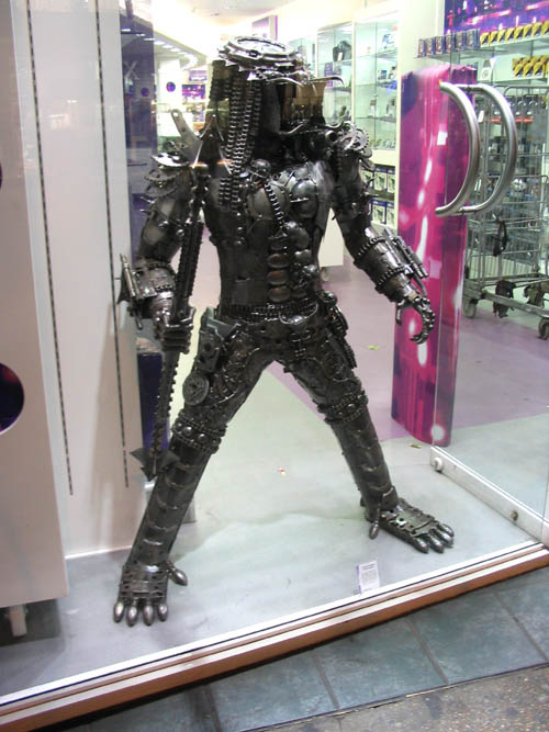
And here's a close-up of its head and shoulders:

Scary, eh? And I really think that this is an original piece of art, rather than some piece of movie spin-off tat mass produced in plastic. All those chains and wheels look to me like someone here in London thought of it, and felt strongly about it.
These photos are going up here because I will shortly be doing a posting at Samizdata about these statues, of a horsey, a doggie-woggie, and two ickle pretty donkeys, which do rather suggest that this country is going soft.
This Predator statue, however, says otherwise, and I will link to this also.
As for how much it is, I didn't at the time think to ask.
Thanks to Dale Amon for the link to this. However, as Dale quickly discovered, it turned out to be untrue, an example not of false prognostication, but of more recent computer graphics.
I especially like the steering wheel …
Which reminds me: Where are the flying cars? I was promised flying cars!!
My point is, yes, we can scoff at the primitive ideas people did indeed have (as Dale rightly points out) circa 1950 about computers, but think how primitive our cars still are, circa 2000.
This one (thank you Dan Prinzing commenting at Transport Blog) looks quite good though.
This (thank you Tom – also commenting at Transport Blog), on the other hand, and like the one I originally wrote about, is just another clunky little airplane.
However, it looks very fetching, especially in this photo of it by Jason Bynum - which I am taking the liberty blah blah …

… - and looking very fetching counts for a lot around here.
So today I had about ten minutes to spare on matters cultural, so I typed "art" into google, and went not for news this time, but images. And I kept going through the pages of pictures until I found something entertaining.
I chose this picture:
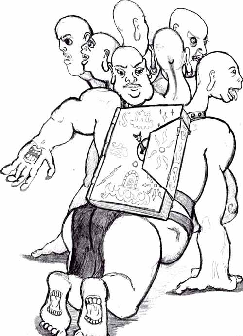
It is one of the pictures here, but what here is, and who all the baldies are, I have no ideas.
It all looks very vulgar to me. I.e. it is the sort of art that you do not need an art critic to enable you to enjoy, and in fact the kind of art where an absence of art critics is probably greatly to be preferred.
Le Corbusier was an odd fish. When I was an architecture student I, like most of my contemporaries, worshipped him dutifully, yet I never really worked him out. On the one hand he dreamed fascist dreams like this:

Yet he was also capable of contriving wonderful places like this:

… which truly is wonderful, but the way. I crossed north eastern France on a bicycle in my teens, entirely to visit this place, and I was not disappointed in the slightest.
I found that picture of this amazing building at this site, which has a www address that starts"alovelyworld" dot com. No way would that hideous pseudo city in the top picture (the "Ville Radieuse"!! – "Radiant City") ever find its way into such a collection of cute tourist type photos.
One should not use words like "fascist" lightly, but Le Corbusier really was pretty much a fascist. And like a lot of other pretty-much fascists he had a thoroughly two-faced attitude towards being modern. Sometimes he was modern in the worst possible sense of that word. At other times he was defiantly ancient, as if recoiling from the horrors he found in the other part of his fevered brain. Sometimes, that is to say, he used modern techniques to do modern, and sometimes he used modern techniques to revive ancientness.
And the irony is that his revived ancientness now looks like it could be as influential in the long run as his brutal modernism has been so balefully influential in the short run.
I think that the truth about Le Corbusier is that he was a compulsively first class architectural talent who just wanted to stick up buildings, and he covered all the bases. Like Picasso, he was fantastically prolific, his ideas to final buildings ratio being positively Darwinian. (The Ville Radieuse, for example, never got built, thank God, or at least not by Le Corbusier!) Like Picasso, Le Corbusier was fiercely ambitious to have an impact. Like Picasso, he had a hell of a lot more than two faces. To get this impact Le Corbusier did whatever would make an impact, given the very peculiar times he lived in. In a different century, Le Corbusier's output would have been totally different. He was a fascist because a fascist is what one was in the times he happened to live in.
That is the best plucking out of the heart of Le Corbusier's mystery I can now manage for you, given that, today, I am in rather of a hurry to finish my bloggings and get stuck into other things.
So I googled for news about "art" and this time, rich findings, in the form of the following excellent headline:
Alliance Francaise de Lahore to showcase Pakistani truck art:
Isn't that great? Gives a whole new meaning to the letters PTA, doesn't it? But sadly, no pictures with that story.
Google again, this time for "Pakistani Truck Art", and wow, what a great set of hits.
These photos are good, particularly this one (because of the mountains in the background) and my favourite, which is this one:

A muse of fire.
More information here.
And it occurs to me that this, which I found here (scroll to the bottom), says something quite profound about where art comes from:
... It is said that many truck drivers, unable to marry because of lack of time or money, pour all of their money, love and inspiration into their vehicles.
Art as sublimated marriage. Implication: allowing pre- and non-marital sex hurts art. Art of a certain sort - obsessional, time-consuming, intricate - yes, maybe. Don't really know, but it's a thought.
Here's a fun article:
At the height of the Cold War, with nuclear holocaust looming, British civil servants were engaged in a high-minded argument as to whether it was better to save priceless works of art or human lives.The debate within Whitehall about how, or even whether, to evacuate masterpieces such as Constable's Haywain, or the Wilton Diptych, took so long that when disaster was truly imminent, no plans were in place, documents recently released at the National Archives reveal.
The Cuban Missile Crisis of October 1962 came and went while the mandarins tried to fine-tune the number of pantechnicons they would need to transfer treasures from the National Gallery and the British Museum to specially prepared quarries in Wiltshire and north Wales.
I seem to recall someone having decked out Constable's Haywain with a mushroom cloud in the background. But googling by me was unsuccessful, so either it's not on the WWW, or I'm a crap googler which is a more likely explanation. Can anyone else do better?
Think what Constable would have done with a nuclear mushroom cloud, had he ever witnessed one.
There are three fine photos over at yesterday's Bleat, which I've only just clocked. Trees – all utterly leafless now, in Lileksland, unlike my Transitional Trees yesterday. (Poingnant note: the ones in the background are doomed. They have dutch elm disease.) A Reflection Photo – now that I like to do these myself, I note that others love to do them too and I see great Reflection Photos everywhere. And: a Strange Building, cleverly photoed to make it look even stranger.
 I took this snap from my own living room window a few moments ago. When autumn first strikes all the tress have leaves, of wildly different colours, some autumnal but others not yet. Now, the big tree is only a skeleton, but behind it colour continues to rage. Click to get the bigger picture.
This may be all I manage today.
I am a fanatical, not to say pathological, collector of different CD performances of the same favourite classical music pieces. This morning, prodded by an emailer, I was checking out different versions of the various Beethoven piano concertos.
To this end, yesterday, I put on the Barenboim/Klemperer recording of the Emperor Concerto, number five, which I remember liking a great deal when I last listened to it.
Yesterday, however, when I played it again, I did not like it nearly so much. Barenboim's piano phrasing seemed relentlessly wrong, even ham-fingered. I did not enjoy the performance at all. How very odd. How come I used to like this performance so much and now liked it so little?
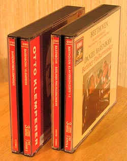 Although after playing it I did put the CD back in its case, I did not return the case back to its place in my CD shelves, and this morning I realised the mistake I had made. I had not been playing the Barenboim/Klemperer version of this piece. I had been playing the later version done by Barenboim conducting the Berlin Philharmonic from the keyboard, with Klemperer nowhere to be seen or heard. I made this mistake because both performances, in the packages I have of them, come in a box of three CDs, because both had "Barenboim" on the spine, because both are from EMI and logoed in the same way, and because the spines of both are the same EMI red colour. I am now listening to the real Barenboim/Klemperer performance, and it is very bit as good as I remembered it as being.
This episode tells me two things.
First, there are limits even to what Daniel Barenboim can do, musically. Maybe he can play the piano part of the Emperor perfectly, while simultaneously conducting an accompanying symphony orchestra, but on this particular occasion, in my opinion, he definitely did not manage to do so satisfactorily, let alone as well as he did with Klemperer.
And second, I was reassured that different performances of the same piece really can be so very different. Possessing as I do so very many multiple copies of different favourite pieces, I am often, frankly, unable to hear much difference, and fear that I have wasted tons of money and yards of space by purchasing pointlessly duplicated pieces which might as well be straight copies of the same disc for all the difference they make. But here was a self-inflicted blind test of my own abilities as a listener, and I passed. My own ears, even when misinformed, did not let me down. I spotted a big difference even when I thought that the two versions I was actually comparing were not two versions at all, but one and the same. So hurrah for me. I can do this! And hurrah for all those different versions of things, because they too may really be different. (See this posting for another such comparison, this time between two different performances by different soloists of the Brahms violin concerto.)
Of course what you really want is for the different versions not to be different from each other by being good or bad (as was the case with these two Barenboim performances – and with those Brahms performances also, see above), but by being good in one way, or good in another. Fast and good or slow and good. "Classical" and good, or "romantic" and good. And as it happens, that emailer I referred to above did alert me to just such a contrast.
However, blogging is blogging, and the rule to follow is: one thing at a time. I am not Neville Cardus, and must not presume upon the attention span of my readers by continuing a posting even when an obvious opportunity for a break presents itself. So, more on this topic later, maybe, I hope.
Late: and the moral of the above, put next to this, is that opinions on these things can differ wildly. Maybe I should have another go at listening to that Berlin performance.
Here are a couple of pictures of TVs, both snapped on the electric toys floor of a big London department store.
These are the bigger ones:

… and these are the flatter ones:

Click on these pics to get even more tellies!
By and large the bigger ones aren't flat yet, and the flat ones aren't big yet, although you can get anything at a price. And the little ones at the back of the top picture aren't either big or flat, merely cheap.
But … the age of the big, flat, cheap TVs cannot be far away.
Incidentally, I have started to notice boxes to stick next to your TV that record TV programmes onto a hard disc rather than only tape, or even rewritable DVDs. I think I might soon be in the market for one of these. The Yanks call these TiVos, yes? Or is that something rather different? Or would it make more sense for me to get a machine that can make DVDs as well.
At present I can't seem to be able to record digital TV onto tape. It goes all wonky. Presumably a box like this would not misbehave thus. ?
Anyone got any opinions about these gadgets?
Incoming email yesterday, from my friend Amoy:
Hi Brian
Hi.
Hope all is well.
That would be a bit of an exaggeration, but, to answer what you mean rather than what you say: yes.
[… personal stuff that is not BCB business …]
I reply, ditto. Then …
I have been keeping a bit up-to-date with your life through your culture blog. All of us here at Londoneasy love it and I must say, you've become quite good with that camera – so many of your photos lend themselves to a thousand stories, which is absolutely brilliant. …
Well, yes, indeed, thank you thank you.
… I am sure you know this though.
It's good to be told again, even so.
A few months ago we launched a new Features Section within Londoneasy. I have a team of four who write daily articles. They are very much in the same vein as yours – short, quirky, anecdotal. We look for stories that try to capture Londoners' preoccupations with the city.
And occasionally profound. Don't forget occasionally profound.
Last week one of my journalists had the cheek of borrowing two of your images for articles we have online: one titled Home Truths, and another titled Culture: Empire in the Capital.We have given you credit for the images. This has only just come to my attention so apologies for not asking in before using. If you are not okay with this, I will take them down ASAP.
Seriously, and as I said to Amoy in my email back, this is fine. My line on other people using my photos is: go ahead, but please give me credit for them, as Londoneasy did. Also, please do, if you are making tons of money, give me a tiny crumb – to encourage the others and all that. If not then don't bother. I leave that to you.
The photopostings here that Amoy is referring to are this one about Foxtonspersons, and this one about Bomber Harris.
My plan for personal global domination includes people using my photos for free and me becoming a world famous layabout instead of the mere layabout that I am now, at which point, then, well, I'll take it from there. I'm just another blogger in other words. So copy away.
Besides which, what Amoy is apologising for having done is what I do anyway, namely not ask permission, give credit, and stand ready to take them down instantly if there is any problem or objection. This seems to be emerging as the blogosphere norm. So far, despite numerous featurings of other people's photos, I have had no grief whatsoever from aggrieved photo-posters.
A final thought. Although I did get credits from Londoneasy, I did not, because that is not how they do things, get any links back to my original postings. Fair enough. But, not problem. Ruminating upon this circumstance, I once again found myself being grateful that my name is Brian Micklethwait, rather than something more like Brian Smith or John Smith. Google for John Smith, and the problem is, of course: which John Smith? Suppose you are seeking the John Smith who, during the Peninsular War, married a Spanish Bride (to quote the title of Georgette Heyer's most amusing novel about that gentleman and lady), who ended up being immortalised, or so I recall reading, in the name of the city of Ladysmith in South Africa. But suppose instead that you get deluged with references to a drearily dead Labour politician. You see the problem. But if you google Brian Micklethwait, you get me and only me. Hurrah. (Caution: if you google only Micklethwait, you get a lot of stuff about my Nth (as N tends to infinity) cousin John Micklethwait.) This means that if Brian Micklethwait gets credited by name for a photo, then that, from the point of view of me building my reputation, is sufficient. No need for a link, because google will quickly find you those blog postings anyway.
Are lots of people even now changing their names from John Smith (or similar) to John Cratchetweaver (or similar), or even to Themistocles Cratchetweaver (just to be sure), for this one reason? It would make sense.
The comment thingy is, as of now, and as helpful emailers have pointed out to me, refusing to supply a Turing Number, only a red cross.
This is, I am told by my Blog Software Guru, being attended to. He doesn't think it should take him long.
This is the stage that Cardinal Place, the progress of which I last reported here, has now reached:
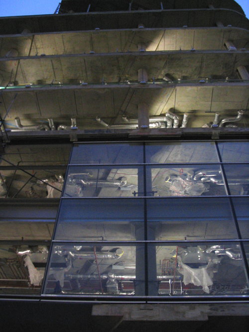
The light was fading fast and there is only so much that Photoshop can do.
Of course if this building were to be filled entirely with trendy restaurants, those pipes would remain visible when the building is finished. But it won't be and they won't.
I remain optimistic about this thing, and I can't wait to get all the shops at the bottom back, and in greatly increased numbers. (There was a stationary supplies shop the absence of which has been a real inconvenience to me.)
The view of this thing from Victoria station (as per the publicity fake-up), looking straight at its bonnet, so to speak, looks as if it will be quite something. But, as always with big buildings, you never really know for sure.
Incoming:
Dear Brian,Thanks for your culture blog, complete with remedial programming and steel orbs.
I figured you would to be receptive to a brothel controversy I report on today.
All good wishes,
Julie
Austin, TX
Yes. And Julie manages to link said controversy to this painting.
But, I was particularly diverted by what she says about Monet.
I will now criticise Instapundit. Twice. I don't remember ever having done this before even once, so this is new territory for me. Perhaps I will be hunted down by goon squads and locked up in a basement at the University of Tennessee.
 Criticism number one of Instapundit is this beyond-frightful picture of him that the Guardian has been using to decorate his recent columns for them. It looks like something contrived for Halloween, and confirms, whether by accident or by design, every Guardianista prejudice about the man that there is. He is nasty, sinister, stupid, ignorant, and if this was an old and cheap black and white movie (which is what it looks as if it was taken from) he would be dead very soon and deservedly so, in the course of trying and failing to do something sinister and nasty.
Either Instapundit chose this photo, in which case he made a big mistake, or the Guardian chose it, in which case they did a very clever thing. If the Guardian chose it, and if Instapundit tried to get them to use another, but they went with this picture anyway, then that is a story and it is a story that the rest of us would, I am sure, love to be told.
And the other criticism I have to offer of Instapundit is that whenever, as he occasionally does, he features a small picture on the right hand side of a posting, he almost always fails to separate the text from the edge of the picture. This results in writing, and particularly the little permalink blob, jamming itself smack dab up against the picture, as for example here, here, here, here, here. here. and here. Here, he either did it right or got lucky, almost certainly the latter. I am not nearly such a clever blogger as Instapundit, but in this particular matter I always do better, this posting being only one of many examples of my superior typographical skills to those of Instapundit when it comes to placing small pictures in my postings, on the right hand side.
In my case the secret is to insert this gobbledegook into the code which inserts the picture:
align="right" img style="{margin-left:10}"
There. That wasn't very hard was it. Well, of course, like everything in computerisating, it is easy if you know it and do it regularly, and totally bloody impossible if you don't and you don't.
More seriously, now that the Old Mainstream Media have been toppled from their perch (my thanks to Instapundit for the link), Instapundit is now New Mainstream Media. And it is the duty of the rest of us to see that he lives up to the high standards that are appropriate for his new and elevated station in life.
In particular, he now has to realise that appearances matter.
UPDATE Nov 13: Incoming email from Gregg A Howard:
Note that the Guardian photo was taken using the "Frankenstein flash" technique used by old chaw 'n' spit newspaper photogs on particularly heinous criminals. It involved holding the flash a foot or two below the lens and the perp's face in order to distort the features in a way much admired by city editors back in the 30's and 40's. (see attached) But surely its use here is simply a coincidence and has no bearing on how GR's opinions are viewed by those at the Guardian.

I don't know whether Howard concocted this composite picture himself or found it somewhere else. The former, I'm guessing, if only because if the latter he would presumably have said. Either way, my thanks.
UPDATE Nov 14:
I did concoct it myself. The photos were scanned from Bloodletters and Badmen (isbn - 087131-113-5).I picked the book up at a library sale for 25 cents some years ago. When I saw the Guardian photo, the inference was immediate. The composite was simple using the five-year-old software that came with this computer. The other faces are those of Harvey Murray Glatman, William Heirens and Stephen Nash.
A few more emails like this, and this blog will start to become a real Culture Blog.
Category: Blogging • Computer graphics • Media and journalism • Photography
 My latest CNE Intellectual Property piece is up. It was triggered by the student who is suing Ground Zero architect David Childs for allegedly nicking one of his student designs to use for the big tower at the heart of the scheme. I then talked about academic idea-stealing in other fields, especially science.
This article, linked to today by A&LD, discusses how the expansion of science may have lowered its ethical standards, a matter also touched on by Michael Jennings (recent picture of him there), in the following email which he sent me in response to my CNE piece:
Whilst academia is indeed full of asymmetric relationships in which more senior academics gain credit for the work of younger people, most scientific fields are small enough, and the participants meet each other at conferences and talk to one another often enough, that in the case of any important work everybody knows who actually did it, regardless of whose name is on the paper. In practice, it is usually a case of figuring out which of the multiple people whose names are on the paper actually did the work. Maybe this is changing as academia gets bigger and more corporate, but I am not so sure. For one thing, scientific research responds to this by breaking up into more and more fields with a relatively small number of individuals in them, and I think this is unlike architecture. It varies from field to field though. Some fields consist of large laboratories with hundreds of people, but most are as I describe.
And the most asymmetric relationship that exists in scientific academia is that between a supervisor/adviser and a PhD student. In most circumstances a supervisor has a de facto veto over whether a student gets a PhD. This can lead to abuses of various kinds, and also to somewhat weird human relationships. Nothing bad happened to me personally in this regard, but I have seen one or two slightly dubious things happen to other people.
Rather amusingly if you have done a PhD, science fiction writer Vernor Vinge – a former mathematics professor himself – wrote a story a year or so back about a professor who has a virtual reality simulation of one of his students created and told that he has to get so much work done in the next year, or he will not be allowed to get his PhD and runs it over and over again to get this hypermotivated student to do near infinite amounts of work for him.
And as for your final comment about someone suing Nobel Laureates, the interesting issue is that in the sciences the Nobel Prize committees have credibility, and scientific Nobel Prizes are considered such a great honour at least partly because they are seen to have almost invariably been given to the right people, and that means the committee goes to great trouble to see that they are given to the people who actually did the work. In particularly controversial circumstances, there have been a number of incidents where people have not received the Nobel prize until decades after they did the original work, and where the prize was awarded within a year or two of the death of the more senior academic who laid claim to the work. More senior academics are usually older, so waiting for the
wrong person to die before giving the award to the right person is a workable strategy.
One thing that comes into play here is that there is no limit on the number of authors that may appear on a paper published in most journals, whereas a Nobel prize in the sciences is never shared by more than three people, which means that if the wrong people are awarded a Nobel prize, the right ones usually miss out. Even within this constraint, though, simply giving the prize to the three people whose names are on the paper is never done. In such circumstances the prize tends to be shared between people doing work in the same or closely related fields for different universities/laboratories rather than by people who worked together.
You can actually tell certain things about who did what by the way in which the prize money is split in a three way award. If the three recipients each get a third of the money, this means either that the three of them did related but separate pieces of work, or that the three of them were involved in doing the same piece of work (either as collaborators or (more often) by coming up with the same results independently). If one of the recipients gets 50% of the money and the others 25% each, then this means that the one who got 50% did a separate but related piece of work to the other two, who were involved in doing the same work, either together or independently.
Category: Architecture • Intellectual property • Science • Science fiction
Busy day, so expect not a lot from me here today, other than this.
On my blog travels I stumbled upon the pictures being emitted in connection with the London Olympic bid.
If this was a Samizdata posting, I would now sneer for a paragraph at the London Olympic bid. But this is not Samizdata, so I will merely say I'm not sure about these edifices. Plus, as a London council tax payer in a part of London that the Labour Party has it in for, I am very nervous about what it will cost me.
I can see these objects working quite well during the Olympics, but then what? What, for instance, will happen to all those huge walkways? The phrase "herd of white elephants" suggests itself.
See a bigger version of this aerial view …

… here. Note that you can see that other white elephant, the Dome, in the distance.
I kind of, vaguely, it must have happened, realised that the Houses of Parliament got burned down some time around when it actually did happen, which was 1834. But I never knew Turner had done a picture of it. Better yet, he actually witnessed it.
This (click to get it bigger) is my favourite of the pictures he did of this dramatic occurrence:

Those miniature Twin Towers must be Westminster Abbey.
This other painting looks odd to me, although it seems to be a bit more famous. The smoke and the bridge collide in a strangely unrealistic fashion, I think. Although, maybe that's what it did look like.
No fire for Turner to paint, and there would have been no this …

… snapped by me a few evenings ago. Commonplace to Londoners. A picture postcard view. (I only did it because I was trying to get the pink vapour trails.) But this is the Internet! I find it hard to believe sometimes, but there are wretches who do not live in London, and who, worse, seldom even visit. And some of these pitifuls have computers and Internet connections, to keep them in touch with civilisation. These people badly need to be shown views such as this.
And I might as well get shot of this shot too, another tourist view, which I took a few moments earlier, looking the other way along the river. The Hungerford Footbridges, which you can just about make out, are the ones with the oddly directed spikes, on either side of the original and very mundane rail bridge.

By the way, the bridge I was on when I took this (Westminster Bridge) is not the one featured in Turner's painting, for that too has been replaced.
Will I ever myself witness anything as dramatic as that fire? If I do, will I have my camera with me? And will my pictures come out as well as Turner's (good) painting?
If the Wheel fell over, would there be warning and could I rush out to catch it falling? Would they replace it? They might. It's very popular.
I wonder what a photo of the fire Turner painted would have looked like. If Photoshop had been invented first, would oil painting (like paper compared to computer screens) have been regarded as an improvement?
 I have been neglecting the visual arts lately, aside from the visual art that emerges from my own camera. So here is a fine piece of work.
Sadly, when I tried to copy it, all I got was what you see here. But go here, scroll down a bit, past the lone guitarist, and see it in all its twenty five times over majesty. Concocted by, I think, this guy. Hope it stays there a while.
Hey! According to my blogging software (as opposed to Photoshop), it moves. It's alive I tell you, alive.
UPDATE: Hang on. I think I can do this.
Groovy.
 I like this photo, which I found here.
Skyscrapers. A reflection in a puddle. Brian's Culture Blog bliss.
The Guardian is making a Shanghai week of it. With luck there will be more photos, though if there are I doubt if most of them will be this good.
Today I was wandering around in the general area of Samizdata HQ in Chelsea, and came across this house - 50 Glebe Place, London SW3. That's a pretty bad photo at the other end of that link, but it gives you an idea. Mine is better focussed but only shows half of it.

I did a proper view from further back, but it came out blurry. Write out fifty times: I will always keep the camera still.
I googled, but all I could find about 50 Glebe Place was "vimero" describing it as "the most beautiful house in London", but saying nothing else about it.
I'll have to try looking in a book, which I don't have time to do now.
And I will also go back and try to do a better photo.
Meanwhile here is another photo of a very different sort of London exterior facade, of the generally rather dull but occasionally, as here, amusing lights in Piccadilly Circus, which I was driven through last night on my way back from doing some radio.

When you photo lights like these, you often get effects of a sort you could never actually see, as in this case. The same thing can happen, but in a less good way, when you photo TV, as I like to do from time to time.
The journey to the BBC last night was a nightmare of diversionary panic, and I only got there with about two minutes to spare. I could have walked quicker. The diversions were because they were putting up the Christmas lights in Oxford Street, which (on the way back) looked really rather good. I snapped away from inside the car, but none of those snaps came out properly either. Funny, on the way, it was nothing but bloody red lights. But when I wanted red lights, so I could snap the Christmas lights from a stationary car instead of a blurrily moving one, it was bloody green greeen green all the way.
I'll be back, on foot.
Michael Jennings has another of his big set piece postings up at Samizdata, about his recent trip to Spain and Portugal. He is a container spotter, it turns out. He includes a most useful map.
Two things caught my eye. First was this observation about recent architectural trends:
(Yes, okay, I realise I am in a minority in that I go to look at industrial sights when I travel, but the most interesting architectural trend in the world is what is being done with decaying industrial structures, and how they are being rebuilt with modern materials and modern design to become commercial and residential centres. The result has a tendency to look like monsters with spider webs growing on them. Bilbao as a whole is maybe the best and most fascinating example of this kind of thing in the world. The Guggenheim museum in Bilbao works architecturally because it understands this and complements the rather brutal architecture around it - not because it is some gem surrounded by a sea of effluent (as most guidebooks seem to suggest). Don't tell me you have missed this trend entirely? Yes. You have missed it entirely).
And the other thing I emjoyed was an aerial photo of the city of Porto, featuring a couple of huge bridges. Porto was nothing but a football club to me, until today.
Porto is a city with a chasm through the middle of it, through which flows the magnificent Douro river crossed by wonderful bridges built during the 20th century.
Here is a river level close up of one of them, which I found here:

What the aerial view does not show, but what this close-up does show, is the way that this bridge (and the other similar one?) doubles up as a high level arch bridge that the trains use, and as a low level suspension bridge that you can drive or walk across. Clever. I've not seen this sort of arrangement anywhere else. But then, I've not been to many places. Certainly not to Porto.
It was about time I had another bridge here.
A few years ago a battle of the gauges began, to see what kind of CD, if any, would replace the regular CD, for playing music.
And the winner is: Hybrid SACD.
This is a Super Audio Compact Disc, which means that it will sound even sexier than a regular Compact Disc, provided that you have a zillion quids worth of SAS (Super Audio Stuff) to play it on, but which, being also "hybrid", will in the meantime play on a regular old coal-powered CD player such as I still have, and will go on having for the foreseeable future until the price of the new kit drops enough (see below).

Hybrid SACD is a format developed by Philips and Sony and combines a SACD (ie physically a DVD layer) with a CD layer.Both layers are read from the same side, which means that the SACD layer must be reflective for the red laser but will transmit the infra red CD laser. Such discs can then be played on both a CD player (which will read the CD layer) and a SACD player.
The original idea may have been to get us all to replace our old CDs, the way we replaced our old gramophone records and cassettes, and what is more go back to buying CDs at "full price" instead of for a fiver or less. But that won't happen. The great CD bonanza of the eighties is not going to be repeated. CDs are okay.
On the other hand, if they want to sell me a Hybrid SACD for the same price as I now pay for a regular CD, to play on a machine which I don't yet have, but in due course will have because it has become as cheap as a regular CD player (see above), well, then, okay.
But if they think that all of us who love, e.g., the Elgar Violin Concerto are going to rush out and buy Hilary Hahn's new DGG version of it, just because it is a Hybrid SACD, and pay DGG an extra tenner for the privilege, despite the fact that the reviewers say it is boring, they will have to think again. A few may splash out on the new format. See the Karajan Beethoven below, which was recorded in 1963! But not enough to rescue business-as-usual.
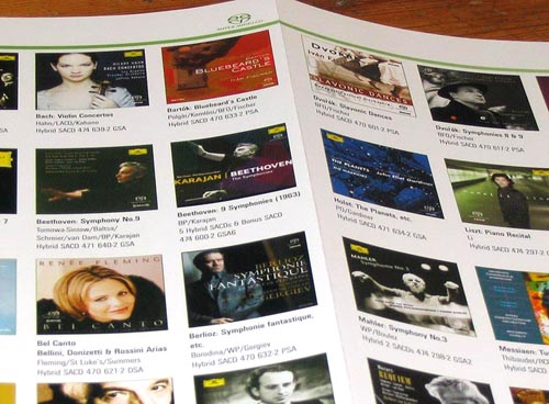
This is a photo (click to get it more legible) of a New Formats classical music flier that came with a DVD I bought recently of Lang Lang at Carnegie Hall. (Worth a go second hand at £6. Not worth remotely the full asking price, from what I hear.)
This is not a new world. It's just the next bit of what really is business as usual, concerning which more anon.
The most interesting thing about Hybrid SACD is probably the re-design of the plastic case which they are using to flag up which is regular CD and which is Hybrid SACD, concerning which more anon also.
Those Fritz Werner Bach CDs were everything I hoped, the second ten being just as wonderful as the first ten. And the second ten were even cheaper, hardly more than twenty quid at the Bond Street branch of HMV (which is in Oxford Street just across the road from Bond Street tube).
Particularly wonderful is track 2 of Cantata BWV 78, which is on CD 3 of these second ten. This is sung by the lady choristers. Werner, and in particular his harpsichordist, who I see now was Marie-Claire Alain, accompany it with a bounce and a joy that I have never heard before. It has become fashionable these days to talk about Bach writing dance music. I've never really heard this myself, until now.
Googling for "Bach Cantata BWV 78" revealed that this particular Cantata certainly seems to strike a lot of chords with a lot of people, and this second movement especially.
Here, for example, the writer zeroes in on this movement, and helpfully supplies the words, to save me typing them in again, in both German …
Wir eilen mit schwachen, doch emsigen Schritten,
O Jesu, o Meister, zu helfen zu dir!
Du suchest die Kranken und Irrenden treulich.
Ach, höre, wie wir die Stimme erheben, um Hilfe zu bitten!
Es sei uns dein gnädiges Antlitz erfreulich!
… and English.
We hasten with weak [feeble], yet eager footsteps,
Oh Jesus, Oh Master, to seek after your help!
You tirelessly seek out the sick and those who have gone astray.
Oh, hear us, as we, our voices raised, pray for your help!
May your merciful countenance be gracious unto us!
The way Werner and his ladies do this makes it sound as if this is already happening.
 These photos of Daniel Barenboim at the temporary until-it's-redone-properly Warner Classics website, especially the three colour ones, are very strange. They make him look not like the quite old gent that he now is, but rather as if he had been made up to look old about thirty years ago, and photoed then. I think it's the fact that they forgot to grey the eyebrows and eyelashes. Maybe he dies his eyebrows and eyelashes black so that he can influence orchestral musicians just by moving his eyebrows and eyelashes up and down, but I doubt this. More probably he is of a physical type whose eyebrows and eyelashes are the last of his hair to turn grey. All the same, it looks odd to me.
Maybe there's been photoshopping, in particular beefing up the colour contrast, and this has had the effect of making him look unreal.
I'm not trying to undermine Barenboim's status as a musician, which is very high and deservedly so. Several decades ago I saw him conduct in London, Mozart mainly, including piano concertos from the keyboard, but especially the late Mozart symphonies. Something about the way he conducted, something about the kind of sound he seemed to want from an orchestra - long legato paragraphs and sonoroties, elbows and armpits as well as just hands, made me think even then that he should in due course be Georg Solti's successor in Chicago, which he later was, and that he would (like Solti) one day make a notable Wagner conductor, which he now is. Even in Israel.
This sounds very interesting:
… Why is music – universally beloved and uniquely powerful in its ability to wring emotions – so pervasive and important to us? Could its emergence have enhanced human survival somehow, such as by aiding courtship, as Geoffrey F. Miller of the University of New Mexico has proposed? Or did it originally help us by promoting social cohesion in groups that had grown too large for grooming, as suggested by Robin M. Dunbar of the University of Liverpool? On the other hand, to use the words of Harvard University's Steven Pinker, is music just "auditory cheesecake" – a happy accident of evolution that happens to tickle the brain's fancy?
Read the whole thing here. Thanks, as so often, to Arts & Letters Daily.
Further quote that I couldn't resist:
… After suffering a stroke in 1953, Vissarion Shebalin, a Russian composer, could no longer talk or understand speech, yet he retained the ability to write music until his death 10 years later. …
He could not understand speech, yet he could write music. Amazing.
I haven't had a quote-unquote type posting here lately. So here's a good one:
"And that’s another of my complaints with blogs in particular and the Web in general: the ease with which people can post and disseminate content."
Check out the context here.
There are lots of autumn pictures around, around now, what with it being, around now, autumn.
I particularly like this one.
Here are two from me, which I wondered whether to bother with, and would not have bothered with had there not been this excuse.


The tower one is of a car roof. I like how the curved roof curves the tower. I like the tower because to me it is home, in the sense that I live (contentedly) opposite the thing and see it every day. If you do not like it, I understand.
If you're not that impressed with these leaves, that's okay. This is the Olde English autumn, not the blazing insanity of colours that is the New England Fall.
I grovel in awe at the feet of the multi-headed comedy search engine that is the Dave Barry blog.
I recently rhapsodised here about some Mozart piano sonata recordings by Ronald Brautigam. And that got me thinking about how Beethoven piano sonatas sound on a similar instrument. So when I came across a bargain box of Beethoven piano sonatas played by Melvyn Tan, on Virgin, five CDs for a tenner, I grabbed it.
 At two quid a throw you can't be disappointed, and actually this is pretty decent playing. But in Tan's hands, I don't find the fortepiano adding much, and I do find it subtracting quite a lot. Again and again, when Tan plays, I found myself thinking that, if this is how it sounded when Beethoven himself played these pieces, then what Beethoven would have wanted them to sound like would be how they do typically sound to us, played on the modern piano.
I found Tan's rhythmic habits somewhat disconcerting. Again and again, I felt that the smooth flow of the music was being needlessly mucked about with, but maybe this is just the result of what I am used to hearing rather than what I ought to be hearing.
I would now love to hear someone else doing those Mozart sonatas on the fortepiano.
And I would also love to hear Ronald Brautigam playing the Beethoven sonatas. (How many (forte)pianists do you now think that of?)
I suspect that I would not especially like the Mozart, but would find Brautigam's Beethoven absolutely thrilling.
When writing about Brautigam's Mozart sonatas, I said that Mozart piano concertos don't sound nearly so good on the fortepiano. Yet, I completely forgot about this posting, in which I rhapsodised also about Brautigam playing the Mozart D minor Piano Concerto, on the fortepiano. This man can really play.
Don't try to say that too fast.
From last weekend's Sunday Times:
THE tactic is more redolent of Stalinist Russia than the rarefied air of an architect’s office. A "team photo" of employees of Lord Foster, who has designed some of the world’s most famous buildings, has been "airbrushed", downgrading the importance of the architect’s former right-hand man.In the original photograph Ken Shuttleworth, a former senior partner, is in pride of place beside Foster. Shuttleworth is credited by many with being one of the creative forces behind Foster's "gherkin" tower in the City of London.
In the published version, however, included in a new book of Foster's work, Shuttleworth has been shunted sideways and back one row into the crowd of some 350 workers.
Graham Phillips, a senior partner who was away when the main photograph was taken, has been pasted into the prime slot at Foster's right hand.
News of the picture doctoring will add to a dispute in the world of architecture over whether Shuttleworth – nicknamed "Ken the Pen" for his rapid, immaculate draughtsmanship – has been given credit for his role in the gherkin.
Shuttleworth, 52, left Foster’s firm in December after almost 30 years to start a rival practice, Make. He employs 18 former Foster staff.
It will be absolutely fascinating to see what Shuttleworth manages to do on his own.
Adam Tinworth has been kind enough to send me copies of Grid, the magazine about property development which he edits, and there is a spread in the latest one he has just sent me about Shuttleworth's plan to build, somewhere in London, the Vortex. But the Vortex picture in Gris seems to be very similar to the one I used in these two postings, so the plan doesn't seem to have advanced very far since June of this year. But maybe there have been developments and I missed them.
Adam's Vortex commenters make the point that a city can only have so many iconic buildings, Gherkin style. I reckon about another dozen such icons should be erected (such as this one), and the Vortex, and a few more memorable edifices, and then London can get back to piling high and selling cheap, i.e. building towers which are collectively impressive but individually less so, like
these ones.
 Warner's are just about giving away lots of discs in HMV Oxford Street at the moment, and one of the more interesting of these gifts (actually it cost £1.99) has been an Apex CD by pianist Til Fellner, playing Schumann's Kreisleriana, and Julius Reubke's Piano Sonata. Stupid cover graphics (like all of this series except the ones with Yehudi Menuhin on the front), but perfectly decent playing, so far as I'm any judge.
I love music for organ plus orchestra – Handel Organ Concertos, Poulenc Organ Concerto, Saint Saens 3rd Symphony, you name it. But I have an aversion to solo organ music, perhaps because it is for ever connected in my mind with compulsory school chapel, a form of compulsion I seem to recall resenting above all others. (Eventually I took to skipping it. The Real Rule under the Official Rule seemed to be that if I didn't boast about this, which I didn't, they wouldn't make a fuss either. They, or some of they, must have known.) Accordingly, the only thing I knew about Reubke until now was that he had perpetrated solo organ music. So to hell with him.
But now with this Piano Sonata disc, at a mere £2, I am willing to give him a go. It's on the CD machine now. Snap verdict: it sounds very like the Liszt Piano Sonata. This is not surprising, since Reubke was one of Liszt's most favourite pupils, apparently. But even given that fact, the resemblance is extreme. So, if you like Liszt piano music, this is highly recommendable. I quite like it. But this is the kind of music, I think, that responds to great playing, of the sort that causes people to say "the playing was better than the music". Fellner is good. I would like to hear someone like Richter, Gilels or Lazar Berman doing it. I'd like to hear someone playing it to the gallery, instead of tastefully.
Reubke died in a hotel room at the age of 24, according the sleeve notes of this CD, but it doesn't say how or why. Nor could I learn this from any other source. Was he a huge loss? Maybe. We'll never know.