

I just watched a nice little TV programme ("Map Man" BBC2 TV 7.30pm) about the London Tube Map, during which a brief reference was made to this:
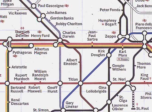
I found my way to it via here. (Scroll down to "The Tube Map as Art".) Art? Well, if an "artist" says so, so be it, but all the art in this is surely down to the original designer, Harry Beck. Simon Patterson's rehash is not very profound, being little more than a joke. But it does show what a very strong design the original is.
Change all the stations, yet still it remains instantly recognisable.
The philosophers go round and round in a circle, going nowhere. Ho ho.
I also found myself being intrigued by the sight of this. Strange how isolating the middle of the original muddle makes it seem so much less muddled.
More Tube mapology here.
Nice things were also said on the programme about the design of the Moscow Underground map.